


Fashion, often considered a mirror of culture, is a constantly evolving field that intertwines creativity, art, and practical wearability. As trends ebb and flow, one element remains: the delicate balance between chaos and harmony in design. At first glance, the notion of chaos in fashion may seem counterintuitive—after all, isn’t fashion all about elegance, structure, and refinement? However, the juxtaposition of chaos and harmony is not only possible in visual design, but it can also create stunning, dynamic fashion that pushes boundaries and challenges traditional aesthetics.
In the world of fashion design, “chaos” doesn’t necessarily mean an unkempt, haphazard mess. Instead, it refers to the deliberate introduction of unexpected elements—disorderly patterns, clashing colors, irregular silhouettes, or unconventional materials. When used thoughtfully, these chaotic elements can contribute to a deeper sense of harmony. This may seem paradoxical, but chaos in visual design often serves as the catalyst for innovation, guiding fashion to new levels of creativity and expression. In this article, we will explore how chaos can contribute to the creation of harmony in fashion, illustrating its role through several key design principles.
1. The Role of Chaos in Design: Understanding Its Purpose
Before delving into how chaos can create harmony in fashion, it is important to define what chaos means in the context of visual design. Chaos in design is not the absence of order but the use of elements that disrupt conventional expectations. Designers who embrace chaos intentionally break traditional rules, experimenting with asymmetry, irregular proportions, unexpected color combinations, and avant-garde forms. This rebellion against symmetry and order gives rise to unpredictability and invites the viewer to engage with fashion in a new way.
However, chaos does not exist in a vacuum. In visual design, chaos is often tempered by the presence of harmony—balance, proportion, rhythm, and contrast. It is this interplay between order and disorder that generates the dynamic tension that defines successful fashion design. The key is finding the right balance: too much chaos and the design becomes confusing or incoherent, while too much harmony results in predictability and stagnation.
2. Contrasting Chaos and Harmony: A Delicate Balance
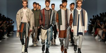
In fashion, as in any art form, balance is crucial. The relationship between chaos and harmony is often explored through the interplay of opposites. Designers who harness chaotic elements use them as counterpoints to structured or classical forms, thereby creating contrast that sparks visual interest. This technique can be seen in both haute couture collections and ready-to-wear lines.
For example, think of a garment where the silhouette is traditional—a sleek, form-fitting dress—but the fabric is an explosion of chaotic patterns, such as fragmented geometric shapes, or bold, clashing colors. The traditional silhouette provides a sense of structure and stability, while the chaotic print challenges the viewer’s expectations, introducing a sense of energy and excitement. This contrast is essential for creating fashion that feels both innovative and grounded.
In other instances, the harmony in fashion might come from the deliberate use of asymmetry. A garment may be intentionally “off-balance” with a sleeve that is longer on one side or a hemline that dips at an unexpected angle. This deliberate choice creates visual tension, yet it does not feel chaotic because there is a clear intention behind it. The beauty lies in how the asymmetry works in tandem with the other elements of the garment, such as color, texture, and material.
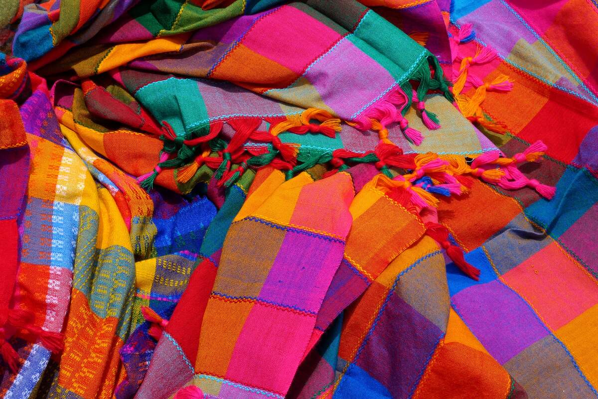
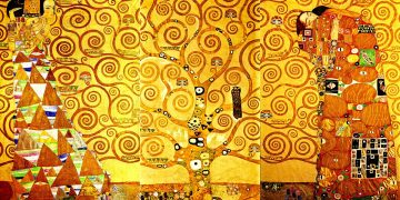
3. Color Theory: Chaotic Color Palettes for Harmonious Impact
Color plays a pivotal role in the creation of chaos and harmony in fashion design. Traditional color theory suggests that harmonious combinations—complementary, analogous, or monochromatic colors—are aesthetically pleasing to the eye. However, chaos in color design arises when these traditional palettes are disrupted. The unexpected combination of clashing colors can generate a powerful sense of dynamic energy.
Consider the use of vibrant, seemingly clashing colors in a high-fashion runway collection. Neon green paired with electric pink or bright yellow with royal blue might initially seem jarring. However, in the hands of an experienced designer, these chaotic colors can work together to create a visual rhythm that pulls the entire design into a cohesive whole. The key is to balance chaotic colors with carefully considered design elements such as pattern, texture, or the silhouette itself, ensuring that even though the colors clash, they don’t overwhelm the viewer.
The notion of “chaotic color” can also be explored through the concept of color blocking—using bold, contrasting patches of color that stand out against one another. While this may seem chaotic at first, it is often the composition of the shapes and the proportion of colors that provide balance, creating a harmonious visual effect despite the discordant nature of the colors themselves.
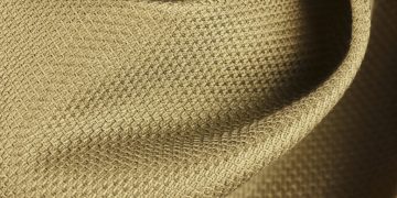
4. Texture and Material: Tactile Chaos Leading to Harmonious Form

Texture plays a crucial role in both chaos and harmony in fashion. The clash of different textures—such as velvet against leather, or denim with silk—can create a chaotic but intriguing visual effect. Textural contrasts often bring a sense of complexity to a garment, adding depth and tactile interest. When combined thoughtfully, these textures can interact in unexpected ways, contributing to an overall harmonious aesthetic.
Designers such as Rei Kawakubo of Comme des Garçons are known for their avant-garde approach to fabric and texture, combining rough, industrial materials with softer, more delicate fabrics. This deliberate clash creates a sense of unpredictability and chaos, but the cohesion comes from the consistent underlying structure of the garment or the conceptual unity behind the collection.
Materials such as metallic fabrics, iridescent finishes, and unconventional textiles can further contribute to the sense of chaos. When layered together, these materials often disrupt the usual flow of fabric and design, creating tension. But much like color, material chaos can lead to harmony if the designer’s vision ties all elements together in a coherent manner, often through consistency in form or an overarching theme.
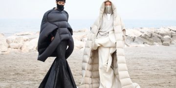
5. Silhouette and Form: Asymmetry and Deconstruction
The silhouette of a garment is perhaps the most direct way in which chaos can contribute to harmony in fashion. A structured, symmetrical design offers clarity and balance, but a more chaotic approach to form can be achieved through asymmetry, deconstruction, and unconventional shaping. Fashion designers like Issey Miyake and Ann Demeulemeester often manipulate the silhouette, incorporating elements of asymmetry or irregularity, which at first may appear discordant. However, these deviations from traditional forms ultimately create garments that are both innovative and harmoniously balanced.
The deconstruction of clothing—where a garment is intentionally left unfinished or fragmented—adds to the chaos in design. Yet, through thoughtful styling and consideration of proportions, these seemingly chaotic designs can result in a harmonious overall look. The asymmetry in a deconstructed design doesn’t need to be resolved immediately; rather, it can draw attention to the wearer’s body in new, fascinating ways, creating a sense of movement and intrigue.
6. The Role of Patterns: From Chaos to Order
One of the most visually striking ways that chaos manifests in fashion is through the use of patterns. Traditional patterns such as stripes, polka dots, or florals are orderly by nature, but when these patterns are manipulated—by distorting their scale, mixing them with contrasting prints, or placing them at unexpected angles—they become chaotic. However, it is the rhythm and placement of these chaotic patterns that brings about a sense of harmony.
For instance, a mix of clashing prints—such as animal print alongside plaid or geometric shapes—might seem like an overwhelming choice. However, when executed with a sharp sense of proportion and style, these chaotic patterns can work together to create a balanced, harmonious look. The key is understanding how to blend scale, color, and form to create a sense of cohesion.
In some cases, the beauty of a chaotic pattern lies in its irregularity. Unpredictable patterns like torn fabric prints or abstract designs have an inherent energy that, when carefully curated, provide a sense of movement and liveliness, which contributes to the garment’s overall harmony.
7. Conclusion: Chaos as a Catalyst for Fashion Innovation
Chaos in fashion design doesn’t necessarily negate harmony; in fact, it often enhances it. The delicate tension between chaos and order sparks new ideas, encourages creativity, and pushes the boundaries of what fashion can be. The resulting designs, while disruptive and innovative, remain grounded in a sense of cohesive aesthetic that invites the viewer to rethink conventional beauty.
Whether through asymmetric silhouettes, chaotic patterns, or the interplay of clashing textures, chaos serves as a powerful tool for fashion designers seeking to make bold, memorable statements. When harnessed effectively, chaos not only creates disruption but also leads to a deeper understanding of harmony, offering fresh perspectives on the intersection between disorder and beauty in the world of fashion.
