Color is much more than just a visual element of design. It has the power to evoke emotions, influence perceptions, and create lasting memories. In branding, color is a language in itself. It communicates to your audience before they even read a word. In fact, studies show that up to 85% of consumers make a snap judgment about a product based on color alone. That’s why understanding color psychology is crucial when building a brand that connects with your target audience on a deeper level.
In this article, we will explore how color psychology impacts branding, the meanings behind different colors, and how to choose the right colors to build a strong, memorable brand identity. We will also delve into the mistakes brands often make with color and how you can avoid them.
What Is Color Psychology?
Color psychology is the study of how different colors affect human behavior, emotions, and decision-making. The idea is that colors can influence people’s perceptions and attitudes, sometimes without them even realizing it. In branding, it’s about using the right colors to create a desired emotional response and to help position your brand in the consumer’s mind.
The impact of color is not purely subjective. It’s rooted in both biology and culture. While some color associations are universal (like red being associated with passion or urgency), others are shaped by societal norms and personal experiences.
Why Color Matters in Branding
Color influences people on both a conscious and subconscious level. It’s often the first thing a consumer notices about a brand, and it can make a lasting impact. When used correctly, colors can:
- Increase Brand Recognition: Brands with distinctive color schemes are easier to remember. For example, think of Coca-Cola’s red, McDonald’s yellow and red, or Tiffany’s signature blue. These colors are part of the brand’s DNA and immediately convey the essence of the brand without any words.
- Build Emotional Connections: Colors evoke emotions, and those emotions influence purchasing decisions. Choosing the right color can create a deep emotional connection with your audience, making them more likely to trust your brand.
- Set the Tone of Your Brand: The colors you choose define the personality of your brand. Whether you want to come across as professional, fun, luxurious, or innovative, the colors you choose will convey that message.
- Differentiate from Competitors: A unique and memorable color palette can help you stand out in a crowded market. When your brand’s color palette is consistent across all touchpoints, it reinforces your identity and helps you carve out a niche.
How Color Affects Consumer Behavior
Color has a psychological impact, which directly influences how people interact with brands. Here are some key effects of color in branding:
- First Impressions Matter
Studies show that the human brain processes images faster than text. Consumers will often make their first judgment about a brand based on the colors used in the logo, website, or packaging. This is why color selection plays such a critical role in brand perception. - Color Creates Trust or Doubt
The right colors can create feelings of trust, security, and reliability. On the other hand, poorly chosen colors may evoke doubt or discomfort. When done right, color psychology can create positive associations that are central to building consumer trust and loyalty. - Color Drives Action
Certain colors are better at inciting action, such as purchasing, signing up, or clicking through. For example, red is often used in “buy now” buttons because it’s attention-grabbing and can create urgency. Blue is used for its calming effect, encouraging longer engagement.
![Color Psychology in Branding: A Comprehensive Guide to Boost Your Brand's Impact [Expert Tips] — TR Brand Design](https://images.squarespace-cdn.com/content/v1/63050429c779f90d9b25ed2c/1722012307613-1AUCPD9RASDCYQKJPE4V/Color+Psychology.png)
The Meaning Behind Different Colors in Branding
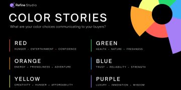
Each color carries its own psychological meaning, and that meaning can be amplified when it’s aligned with a brand’s values. Here’s a breakdown of some of the most common colors and their associations:
1. Red – Passion, Excitement, Urgency
Red is one of the most powerful and attention-grabbing colors. It is associated with passion, love, and energy, which is why it’s often used by fast food chains, clearance sales, and retail promotions. Red stimulates excitement and urgency, which is why it’s often used in call-to-action buttons.
- Brands: Coca-Cola, Target, Netflix, McDonald’s
2. Blue – Trust, Professionalism, Calm
Blue is one of the most universally liked colors. It evokes feelings of calmness, reliability, and trust. Brands that aim to convey professionalism, stability, and security often use blue, making it a popular choice for tech companies, financial institutions, and healthcare providers.
- Brands: IBM, Facebook, Samsung, American Express
3. Yellow – Optimism, Happiness, Caution
Yellow is the color of sunshine and positivity. It is often used to convey optimism and happiness. However, it’s a color that also demands attention, which is why it’s often used for signs, warnings, and alerts. It’s an effective color to use in the context of promotions and youthful brands, but it can overwhelm if overused.
- Brands: McDonald’s, IKEA, National Geographic
4. Green – Nature, Health, Growth
Green is associated with nature, health, and wellness. It’s often used by brands in the food, eco-friendly, and health industries. Green conveys a sense of growth and prosperity, making it a fitting choice for brands that want to project an image of sustainability and renewal.
- Brands: Whole Foods, Starbucks, Spotify, Tropicana
5. Orange – Energy, Creativity, Fun
Orange is a vibrant, energetic color that represents creativity, enthusiasm, and fun. It is often used by brands targeting younger or more dynamic audiences. Because it’s not as intense as red, orange can also create a sense of friendliness and warmth.
- Brands: Fanta, Nickelodeon, SoundCloud, Amazon
6. Purple – Luxury, Creativity, Wisdom
Purple is often seen as a luxurious and regal color. Historically, purple dyes were expensive, so the color became associated with royalty and wealth. Today, purple is also used to convey creativity, mystery, and wisdom. It’s popular among beauty and high-end brands.
- Brands: Tiffany & Co., Yahoo!, Hallmark
7. Black – Sophistication, Power, Elegance
Black conveys sophistication, power, and elegance. It’s a popular color for high-end brands, especially in the fashion and automotive industries. Black is also timeless, versatile, and works well with almost any other color, making it a great choice for luxury brands.
- Brands: Chanel, Apple, Nike, Gucci
8. White – Purity, Simplicity, Cleanliness
White is often associated with purity, cleanliness, and simplicity. It’s widely used in healthcare, tech, and minimalistic brands. It can be used to create contrast with other colors, and is often used in combination with black for a sleek, modern feel.
- Brands: Apple, Tesla, Adidas, Toyota
How to Choose the Right Colors for Your Brand
Now that we understand the psychological impact of colors, how do you go about choosing the right ones for your brand?
1. Define Your Brand Personality
Your brand’s personality should be the foundation of your color choices. Are you fun and energetic, or do you want to come across as professional and trustworthy? Understanding the core values of your brand will help guide your color decisions.
2. Know Your Target Audience

Who are you trying to reach? Different demographics respond to colors differently. For example, millennials may respond better to vibrant, bold colors, while an older demographic may gravitate toward more muted, sophisticated tones. Gender, age, and culture all play a role in color perception.
3. Consider the Emotional Impact
Think about the emotional tone you want to set. Do you want to excite people or calm them down? Inspire trust or create a sense of urgency? The emotional association of a color should align with the message you want your brand to communicate.
4. Think About Industry Norms
Certain industries have color conventions. For example, tech companies often use blue to convey trust and reliability, while eco-friendly brands may lean toward green. While it’s important to stand out, consider what your audience might expect from brands in your sector.
5. Test and Iterate
Color selection is not a one-time decision. Conduct A/B testing to see how different color schemes perform with your audience. Small tweaks in your brand colors can make a significant difference in your conversion rates and brand perception.
Common Mistakes to Avoid in Color Selection
Even with a strong understanding of color psychology, it’s easy to make mistakes when choosing a color palette for your brand. Here are some common pitfalls to avoid:
- Overuse of One Color
A monochrome palette may be striking, but overusing a single color can make your brand seem one-dimensional. A diverse palette creates balance and keeps your brand looking fresh. - Ignoring Cultural Differences
Color meanings can differ dramatically across cultures. For example, while white symbolizes purity in Western cultures, it can be associated with mourning in some Asian cultures. Be mindful of cultural contexts when choosing colors for global audiences. - Inconsistent Use of Colors
Inconsistent color use can confuse consumers and weaken brand recognition. Ensure that your color palette is applied consistently across all marketing materials, from your website to packaging to social media. - Not Considering Accessibility
For consumers with color blindness, certain colors can be difficult to distinguish. It’s important to choose colors that work well for people with visual impairments to ensure your brand is inclusive and accessible.
Conclusion: Color as a Brand’s Secret Weapon
Color is a powerful tool in shaping consumer perceptions and influencing their decisions. When used strategically, it can create an emotional connection, increase brand recognition, and set your brand apart from competitors. By understanding color psychology and carefully choosing colors that align with your brand’s personality and values, you can build a memorable and impactful brand identity.


