


Introduction
Human beings are visual creatures. A significant portion of the information we process daily comes through our eyes, influencing our thoughts, behaviors, and emotions. Whether it’s a vibrant sunset, a poignant photograph, or a simple logo, visuals have the power to evoke intense emotional responses. But why do some visuals affect us more deeply than others? What factors—biological, psychological, cultural, or even social—play a role in how visuals shape our emotional experiences?
This article delves into the fascinating world of visual perception, emotion, and design. It explores the underlying principles that make certain images more compelling and emotionally stirring than others, providing a scientific yet accessible explanation for these phenomena.
The Science of Visual Perception
Before diving into the emotional impact of visuals, it’s important to understand how we process them. The brain processes visual information through the visual cortex, which interprets light, color, shape, and movement. Visual stimuli are rapidly filtered by this part of the brain, and certain patterns are flagged as significant or worthy of attention.
Biological Sensitivity to Visual Stimuli
Human beings are naturally predisposed to respond to certain visual cues. For example, research has shown that humans are particularly sensitive to faces, particularly those that display emotional expressions. The human face is an iconic visual stimulus—our brains are hardwired to detect it, and we can even recognize faces in abstract forms like clouds or rock formations. The amygdala, a brain structure involved in emotion processing, lights up when we see emotional faces, triggering strong emotional responses like empathy, compassion, or even fear.
Moreover, evolutionary psychology suggests that humans are wired to respond to visual cues that indicate potential danger or safety. A bright red color, for instance, may evoke a sense of urgency or danger, while soft blues and greens can evoke feelings of calmness and serenity. These instinctive responses are a product of our evolutionary history, where certain colors and patterns were crucial for survival.
Color and Emotion: A Symbiotic Relationship
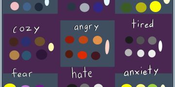
One of the most well-known and widely discussed factors influencing emotional responses to visuals is color. Color psychology—the study of how colors influence emotions—suggests that different colors trigger different emotional responses. Let’s look at how this works:
- Red: Often associated with passion, energy, and danger, red can elicit feelings of excitement or even aggression. It stimulates the body by increasing heart rate and blood pressure. As such, red is frequently used in marketing to create urgency or attract attention.
- Blue: Calm and soothing, blue is typically linked with tranquility, reliability, and trustworthiness. It can lower heart rates and promote feelings of calmness and relaxation. This is why many companies, especially in finance and healthcare, use blue in their logos.
- Yellow: Bright and attention-grabbing, yellow is often linked to optimism, happiness, and warmth. However, in excess, yellow can be overwhelming or create feelings of anxiety. It is commonly used to grab attention or convey a sense of joy.
- Green: Green, often associated with nature, growth, and renewal, evokes a sense of balance and peace. It’s used to create a feeling of harmony, safety, and wellness. The color also has a calming effect on the mind, making it ideal for spaces meant for relaxation or healing.
- Black and White: The stark contrast of black and white often symbolizes clarity, sophistication, and simplicity. Black can be seen as mysterious or powerful, while white evokes purity and simplicity. Together, they are often used to convey a high level of contrast and tension, evoking feelings of drama or elegance.
The color of a visual scene or object can dramatically alter the way it makes us feel, due to these deep psychological associations.
Shapes and Patterns: The Geometry of Emotion
Another critical factor that influences emotional responses to visuals is shape. Humans have innate preferences for certain shapes that influence how we respond to images.
- Curved Shapes: Rounded, smooth shapes like circles and arches are often perceived as friendly, comforting, and safe. These shapes remind us of things like the human form (e.g., a face) or nature (e.g., the sun). We naturally gravitate toward soft, fluid shapes because they tend to be associated with safety and harmony.
- Sharp Angles and Jagged Edges: Sharp angles and jagged lines, on the other hand, can evoke feelings of tension, chaos, or aggression. These shapes are associated with danger and unpredictability, as seen in lightning bolts, jagged rocks, or even sharp knives.
- Symmetry vs. Asymmetry: Symmetry in design often evokes a sense of order, balance, and beauty. Humans tend to find symmetrical shapes more pleasing and harmonious. Asymmetry, however, can feel unsettling or disorienting, and this can create feelings of anxiety or curiosity depending on the context.
The way shapes are arranged, combined, and framed within a visual can significantly alter its emotional impact on the viewer.
Cultural and Contextual Influences
While there are universal aspects of visual perception, cultural and contextual factors also play a substantial role in how visuals are interpreted emotionally. For example, a visual representing a cultural symbol may carry emotional weight based on one’s background or personal experiences.
- Cultural Symbolism: Certain symbols carry specific meanings depending on the culture. For instance, in Western cultures, a dove is often seen as a symbol of peace, while in some Middle Eastern cultures, it may represent purity or hope. The red color mentioned earlier, while signifying danger in some contexts, can also symbolize luck and prosperity in other cultures, such as in Chinese tradition.
- Context and Personal Experience: The emotional response to an image is heavily influenced by an individual’s personal experiences. Someone who has had positive experiences with nature may feel joy or tranquility when viewing a serene landscape, whereas someone who has experienced loss in a natural disaster might feel anxiety or sadness.
Cultural understanding shapes the lens through which we view a visual, making the emotional impact of an image not just a biological or universal response but one deeply entwined with our social realities.
The Power of Movement and Storytelling
Visuals that tell a story are often more emotionally engaging than static images. A visual that implies motion, change, or progression taps into the human desire for narrative, drawing the viewer into a deeper emotional connection.

The Influence of Motion
Humans are naturally drawn to motion, as it often signals a need for attention or action. For example, a slow-moving video of a sunrise evokes peaceful emotions, while fast-paced action scenes, with quick cuts and rapid movements, might trigger excitement or anxiety. The rhythm and flow of a moving visual shape how we interpret the emotional content, with slow movements often inducing calmness and fast movements inducing heightened emotions like thrill or fear.
Visual Storytelling
Storytelling in visuals can evoke powerful emotions by appealing to the viewer’s sense of empathy and connection. A visual that shows a character experiencing joy, sorrow, triumph, or defeat can stir deep emotional responses by mirroring the emotional rollercoaster of real-life experiences. This is why films, photography, and even simple advertisements are often designed with a strong narrative thread—because people relate to stories, and stories elicit emotional engagement.
How Artists and Designers Craft Emotional Responses
Artists, photographers, filmmakers, and designers understand these principles and often use them intentionally to evoke specific emotional responses from their audience. Whether in advertising, social media content, or visual art, design elements are carefully chosen to produce a desired emotional outcome.
Contrast and Juxtaposition
A popular technique in visual design is the use of contrast—whether it’s through color, light, texture, or subject matter. High contrast images tend to evoke strong emotions because the difference in elements creates tension and drama. In contrast, images with minimal contrast are often more serene and balanced.
Visual Hierarchy
Designers also use visual hierarchy to guide the viewer’s emotional journey. By arranging elements in a way that leads the eye through an image, the emotional response can be carefully sculpted. For example, a designer might use a focal point to draw attention to a particular element in an image, evoking curiosity or surprise. The arrangement of visual elements thus guides the emotional flow of a scene or image.
Conclusion
Visuals are powerful tools that can elicit a wide range of emotions. The science behind why some visuals evoke stronger emotional responses than others is multifaceted, encompassing biological, psychological, and cultural factors. Whether it’s the color palette, the shapes, the movement, or the underlying narrative, each aspect plays a crucial role in shaping how we respond emotionally to what we see.
Understanding these principles not only deepens our appreciation for art and design but also empowers us to harness the power of visuals in our own creative and professional endeavors. As technology continues to evolve, so too will our ability to craft visuals that connect with people on a deeper emotional level.


