


Introduction
In the ever-evolving world of user interface (UI) design, trends come and go at a rapid pace. One of the most persistent and intriguing of these trends in recent years is dark mode. Initially a niche feature, dark mode has surged in popularity, with tech giants like Apple, Google, and Microsoft integrating it into their operating systems, apps, and platforms. But the question remains: Is dark mode just a passing fad, or has it become an indispensable part of our digital experience? In this article, we’ll explore the origins, benefits, challenges, and future of dark mode to answer this pressing question.
1. The Rise of Dark Mode: A Historical Overview
Dark mode’s rise can be traced back to the early days of computing. In the late 1970s and 1980s, the first computer screens were monochrome, often displaying green or amber text on a black background. This wasn’t because designers preferred the aesthetic, but rather a product of the limited technology at the time. Early computer screens used cathode ray tube (CRT) technology, which had a black background due to the way the pixels were illuminated.
Fast forward to the 2010s, and the trend of dark mode began to re-emerge, albeit for different reasons. The initial popularity was driven by tech enthusiasts and developers who appreciated the aesthetic contrast and reduced eye strain during late-night coding or browsing. The introduction of dark themes in popular apps like Twitter and YouTube further contributed to the shift. When Apple added dark mode to macOS Mojave in 2018, it became clear that dark mode was no longer just a developer’s tool — it was a mainstream feature.
2. Why Do People Love Dark Mode?
The appeal of dark mode lies in several compelling factors:
2.1 Reduced Eye Strain
One of the primary reasons users gravitate toward dark mode is the reduction of eye strain. Traditional bright screens, especially in low-light environments, force the eyes to work harder, leading to discomfort. Dark mode, on the other hand, minimizes the contrast between the screen and the surroundings, making it more comfortable to look at for extended periods.
2.2 Battery Efficiency
On OLED and AMOLED screens, dark mode offers a significant benefit: energy conservation. These types of screens work by lighting up individual pixels, meaning that pixels displaying dark colors use less energy than those showing bright ones. As a result, using dark mode can extend the battery life of devices, especially for those who rely heavily on their smartphones.
2.3 Aesthetics and Customization
For many users, dark mode simply looks cooler. The sleek, modern look appeals to those who enjoy a more minimalist, high-tech vibe. Additionally, dark mode offers more customization options, allowing users to tailor their digital experience to their personal preferences.
2.4 Improved Sleep Patterns
The blue light emitted by screens is known to interfere with melatonin production, the hormone that regulates sleep. While the overall impact of blue light on sleep is still debated, some studies suggest that using dark mode, especially at night, may reduce the disruption to the circadian rhythm and improve sleep quality.
3. Dark Mode in the Digital Ecosystem
Dark mode’s impact isn’t just a matter of personal preference. It has become an integral part of the broader digital ecosystem.
3.1 Adoption by Major Platforms
When tech giants like Apple, Google, and Microsoft embraced dark mode, it signaled a shift toward the mainstream acceptance of this feature. Apple’s iOS 13 and iPadOS 13, released in 2019, introduced system-wide dark modes, making it easy for users to toggle between light and dark themes. Google followed suit with Android 10 and several of its key apps, including Gmail and Google Maps. Even social media platforms like Twitter, Facebook, and Instagram have incorporated dark mode into their apps.
3.2 Dark Mode in Web Design
Web design has also evolved in response to dark mode’s popularity. Websites and web apps have begun adopting dark mode, either by offering a toggle for users or by automatically detecting system-wide preferences. Frameworks like Bootstrap now include built-in support for dark themes, making it easier for web developers to implement them. Additionally, dark mode has sparked a wave of interest in creating “dark-friendly” web design elements, such as high-contrast text and optimized color schemes.
3.3 Gaming and Streaming
Dark mode has found a natural home in the gaming and streaming communities. Many modern video games, streaming platforms, and media players offer dark mode as an option to improve the immersive experience. Dark backgrounds, in particular, allow the vibrant colors of games or videos to pop, making them more engaging.
4. The Psychological Effects of Dark Mode
Beyond its technical and aesthetic benefits, dark mode also carries psychological implications. While some users find dark themes more soothing and calming, others may experience negative effects, including difficulty reading or a sense of detachment from the digital world. Understanding how dark mode affects user behavior and perception can help companies design more effective interfaces.
4.1 Emotional and Cognitive Impact
Research suggests that dark mode can influence how users perceive information and interact with digital content. Some studies have shown that dark backgrounds can make certain elements, such as buttons and images, stand out more, leading to a heightened sense of focus. However, other research indicates that dark mode can impair reading speed and comprehension due to the lower contrast between text and background.
4.2 User Preferences and Habits
While dark mode is undoubtedly popular, it’s not universally preferred. Some users still prefer the bright, high-contrast nature of light mode. For instance, dark mode may be harder to read in certain situations, such as under bright light or in environments with glare. As a result, many apps and platforms offer users the flexibility to toggle between light and dark modes, allowing them to choose based on their context and mood.
5. The Challenges of Dark Mode
Despite its growing popularity, dark mode is not without its challenges. Designers must be mindful of several factors when implementing dark themes to ensure an optimal user experience.
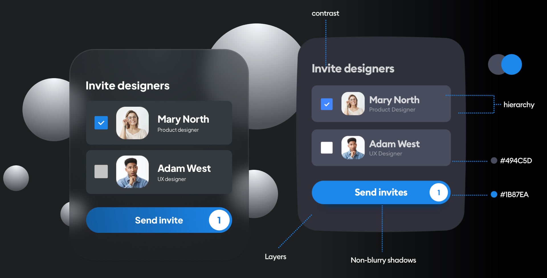
5.1 Color Contrast and Legibility

One of the primary concerns with dark mode is the issue of legibility. While light mode typically uses dark text on a light background, dark mode reverses this, which can lead to issues with readability, especially for longer text. Low contrast between text and background can make it difficult for users to read, particularly in lower-quality displays. Designers need to carefully choose colors that balance aesthetics with functionality.
5.2 Consistency Across Platforms
Another challenge is maintaining consistency across different platforms. A dark mode theme may look great on one app or device, but inconsistent implementation across multiple platforms can disrupt the user experience. Ensuring that dark mode works well on smartphones, desktops, and tablets requires rigorous testing and design refinement.
5.3 The Fatigue Factor
While dark mode is often seen as easier on the eyes, it can also cause visual fatigue when used for extended periods. The stark contrast between dark backgrounds and bright content may lead to discomfort, particularly when reading large blocks of text. As with any design trend, moderation is key, and users should be encouraged to switch between modes depending on the task at hand.
6. The Future of Dark Mode: A Trend or a New Standard?
So, is dark mode here to stay? The answer is likely yes, but with some caveats. While dark mode offers numerous benefits, it’s not a one-size-fits-all solution. As more companies adopt it and as technology continues to improve, we can expect dark mode to become a permanent feature of the digital landscape. However, the future of dark mode may involve more nuanced and personalized approaches, with users able to tailor their experiences based on time of day, context, and personal preferences.
6.1 Adaptive User Interfaces
In the future, we might see more intelligent systems that adapt the user interface based on environmental factors, like ambient light, the user’s activity, or even their mood. These adaptive interfaces could switch between light and dark modes in real-time, offering an experience that’s optimized for the user’s context.
6.2 Greater Customization
As dark mode evolves, we might also see more granular controls for customization. Instead of a simple toggle between light and dark themes, users could have the ability to fine-tune elements like contrast, color schemes, and brightness levels to suit their needs.
6.3 Health Considerations
With growing awareness of the potential effects of screen time on physical and mental health, dark mode’s benefits might also be leveraged as part of broader initiatives to promote healthier digital habits. As more studies are conducted on the impact of screen time and light exposure, designers may refine dark mode features to better accommodate user well-being.
Conclusion
In summary, dark mode is not just a passing trend but a fundamental shift in how we interact with technology. It offers practical benefits, such as reduced eye strain, better battery life, and improved sleep quality, while also providing a fresh aesthetic for users. However, its widespread adoption also brings challenges, such as maintaining legibility and consistency across platforms.
As digital design continues to evolve, dark mode will likely remain a prominent feature of the digital experience. It may become even more refined and personalized, with more sophisticated systems designed to optimize user interfaces for a variety of needs. So, while the trend might shift over time, the core appeal of dark mode — its comfort, flexibility, and aesthetic allure — is here to stay.


