


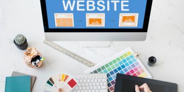
In a world where attention spans are shorter than ever, the way you present information on your website or in any digital space can make or break your user experience. A critical tool at your disposal for guiding your audience is visual hierarchy. This often-overlooked design principle is the art and science of arranging elements on a page to direct the viewer’s attention in a way that feels intuitive, engaging, and easy to follow. When done right, it transforms passive observers into active participants.
But the real question is: Are you using the right visual hierarchy to guide your audience effectively?
What Is Visual Hierarchy?
Visual hierarchy refers to the arrangement of elements in a way that establishes order, prioritizes key information, and leads the viewer through content. It’s about creating a clear path for the eye to follow, guiding people toward the most important elements first, while ensuring secondary and tertiary information doesn’t compete for attention.
Imagine reading a book. You instinctively know to read the title first, then the headings, and then the body text. The visual hierarchy on a webpage or in a printed piece of content works in much the same way. The goal is to give users a clear sense of where to look first, second, and third.
Why Is Visual Hierarchy So Important?
Think about it: users are constantly bombarded with information. Whether they’re browsing your website, scrolling through social media, or navigating a blog, there’s an overwhelming amount of content competing for their attention. If your content isn’t organized well, visitors will quickly get lost, overwhelmed, or frustrated. They might even leave without taking action, whether that’s reading further, making a purchase, or signing up for your newsletter.
Good visual hierarchy helps:
- Increase user engagement: When information is structured properly, users can easily digest content, leading them to spend more time on your page.
- Enhance readability: Proper use of size, spacing, and contrast can make text more readable, allowing your audience to absorb key messages.
- Encourage action: By strategically placing calls to action (CTAs), buttons, or forms, you can lead users towards the next steps without confusing them.
- Create a seamless user experience: Good visual hierarchy ensures your design feels intuitive, providing a smooth journey from start to finish.

Key Principles of Visual Hierarchy
To harness the full power of visual hierarchy, understanding its core principles is essential. Here are the main techniques and elements to consider when designing with visual hierarchy in mind:
1. Size and Scale
The size of an element often dictates its importance. The larger something is, the more attention it demands. In web design, this typically means larger fonts for headlines, which immediately attract the reader’s eye. Think of it as your way of shouting: “Hey, look here first!”
For example, the title of a blog post is usually much larger than the body text because it needs to grab attention immediately.
- Large Elements = High Priority: Larger images, buttons, and headings should always come first.
- Smaller Elements = Low Priority: Text in the footer, secondary details, or less critical information should be smaller.
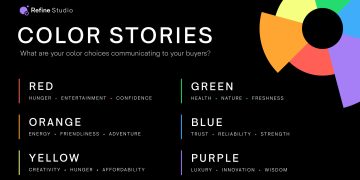
2. Color Contrast
Color is one of the most powerful tools in design. Not only does it help break up sections and add personality, but it also plays a significant role in guiding the eye.
Contrast in color helps create emphasis. For example, a bright red button on a muted background naturally draws attention. If the background is light, darker text elements will stand out more, while lighter text will be less prominent.
- High Contrast = High Focus: Bold, contrasting colors like black and white or vibrant hues paired with neutral backgrounds can emphasize critical components.
- Low Contrast = Subtle Attention: Pastel colors and subtle gradients can give background or secondary elements a more passive presence.
3. Typography
Typography is the art of arranging text to make it legible, readable, and visually appealing. The way text is styled can have a massive impact on how people read and engage with it.
- Hierarchy within Text: The use of different font sizes, weights (bold, light), and styles (italic, underline) guides the viewer through the content, making it easier to follow.
- Clear Typefaces: Clean, easy-to-read fonts should be used for body copy, while decorative or distinct typefaces can be used sparingly for headlines or accent text.
4. Spacing and Proximity
Whitespace, or negative space, isn’t just empty space—it’s a crucial element in visual hierarchy. Proper spacing between elements makes your design more readable and less overwhelming. It also helps create a natural flow for the eye, allowing users to focus on one section at a time.
- More Space = Greater Emphasis: Important elements often benefit from more space around them, signaling to the viewer that they deserve attention.
- Tight Spacing = Grouped Elements: Related information should be placed closer together, creating a sense of organization and coherence.
5. Alignment
Alignment refers to how elements are arranged in relation to one another. Proper alignment creates clean, organized, and balanced designs that naturally guide the viewer’s gaze.
- Left-Aligned Text: Common in Western culture, left-aligned text is the most natural way to read and helps avoid clutter.
- Centering for Emphasis: Center-aligned elements can be used for a focal point, such as a title or a call to action.
6. Visual Flow

Visual flow refers to the way your eyes naturally move across the page. The goal is to lead your viewers’ eyes in a seamless journey, encouraging them to take in the content in a specific order.
- Z-Pattern: In Western cultures, people read in a “Z-pattern” across a page. Designers often use this natural reading flow to place the most important elements along the top and bottom edges, with secondary information in the center.
- F-Pattern: Another common pattern, especially for blogs and articles, is the “F-pattern,” where readers tend to focus on the top-left and then scan down the page in a rough F-shape.
7. Imagery and Icons
Images, illustrations, and icons can significantly enhance the visual hierarchy of a page. However, the key is to use them intentionally and sparingly. Images should serve a purpose—either to complement the message or to break up text-heavy sections.
- Hero Images: Large images at the top of a page are often used as a visual hook, immediately drawing attention.
- Icons and Illustrations: Icons can be used to represent ideas, break up text, or serve as navigation tools, while illustrations can add personality to your page.
Practical Applications of Visual Hierarchy
Web Design
In web design, visual hierarchy plays an even more crucial role. Websites are often visited in a “scan-and-skim” manner, meaning visitors are unlikely to read every word of text. To guide their attention:
- Primary Navigation: Make sure the menu is easy to find, with bold text or high-contrast colors.
- Call-to-Action (CTA): Place CTAs in prominent positions (usually toward the top or middle of the page) and use contrasting colors to make them stand out.
- Content Layout: Use grid layouts to organize content logically and evenly spaced. Ensure your headlines are clearly distinguishable from body copy.
Advertising and Social Media
For digital ads or social media posts, visual hierarchy can make or break your chances of engaging users. Key strategies include:
- Bold Headlines: Use large, eye-catching text for the key message, ensuring it’s the first thing users notice.
- Effective Imagery: Select images that evoke emotion or curiosity, but ensure they don’t overshadow the main message.
- Concise Text: Keep your message simple. Too much text can overwhelm viewers, while short, impactful statements create intrigue.
The Role of Visual Hierarchy in Accessibility
Good visual hierarchy not only guides the viewer’s attention but also ensures accessibility. For those with visual impairments, proper contrast and font sizes make a big difference in readability. Additionally, thoughtful design elements such as alt text for images and a logical flow of content help ensure that all users, regardless of their abilities, can navigate your content effectively.
Conclusion
Effective visual hierarchy is more than just a design choice; it’s a strategic tool for guiding your audience, improving user experience, and increasing engagement. By thoughtfully employing size, color, typography, spacing, and imagery, you can create designs that feel intuitive and natural. The next time you sit down to design a page, whether for the web, print, or social media, remember: Your audience doesn’t just need information—they need direction.


