


In an age of ever-evolving design trends and shifting cultural influences, the concept of a visual identity has become more important than ever. Whether you’re a startup, an established brand, or an individual looking to carve out a unique presence, the visual identity you create will define how people perceive you. But the challenge isn’t just about making something memorable in the short term — it’s about creating a visual identity that can endure through time, staying relevant, appealing, and impactful for years to come.
In this article, we’ll explore strategies for ensuring your visual identity doesn’t just follow fleeting trends but instead stands as a timeless representation of your brand values, audience needs, and cultural relevance.
1. Start with a Strong Foundation: Core Values and Mission
Before diving into colors, fonts, and logos, it’s essential to understand the deeper foundations of your brand. What are the core values that drive your organization? What is the mission you’re committed to? These intangible elements form the bedrock upon which your visual identity should be built.
Timeless designs don’t just resonate because they look good; they resonate because they communicate something genuine and meaningful. Brands like Apple, Coca-Cola, and Nike are not just famous for their logos but for how those logos communicate their deeper values — innovation, happiness, and empowerment, respectively. These values remain constant, and so do their visual representations.
Tip: Start by identifying your mission, vision, and values, and ensure that your visual identity reflects these in a way that can be understood universally and endure across time.
2. Simplicity Over Complexity
One of the hallmarks of timeless visual identities is simplicity. While complex, intricate designs might appear trendy at first, they can quickly become dated or difficult to reproduce. Timeless designs, on the other hand, are often deceptively simple — clean, uncomplicated, and versatile.
Consider the example of iconic logos like the Nike swoosh or the McDonald’s Golden Arches. These symbols are minimalistic yet packed with meaning, and they maintain their clarity and impact whether they’re scaled up on a billboard or shrunk to fit on a mobile screen.
Tip: Focus on creating a visual identity that can stand alone and still communicate your message clearly without relying on excessive detail. Think of how your design will look across a variety of mediums, both large and small.
3. Choose Colors Wisely
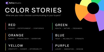
Color is one of the most powerful tools in design. It’s a universal language that evokes emotions, conveys meaning, and creates associations. However, color trends come and go. While it may be tempting to latch onto the latest color palette, such trends can quickly become outdated. The key to a timeless color palette is to choose shades that are versatile, adaptable, and speak to your brand’s personality.
Brands like Coca-Cola and Tiffany & Co. have carefully selected colors that have become synonymous with their identities. Coca-Cola’s red is bold, energizing, and instantly recognizable, while Tiffany’s blue conveys luxury, elegance, and trust.
Tip: Opt for a color palette that has longevity. Avoid using overly trendy colors and focus on timeless hues that will resonate across different cultures and generations. Consider the psychology of color and what emotions you want your audience to feel.
4. Typography That Transcends Trends
Typography is often an overlooked aspect of visual identity, yet it plays a crucial role in the overall design language of a brand. Similar to color, typography trends evolve, but the challenge is to choose a typeface that reflects your brand’s essence without relying on fleeting trends.
Take Google’s logo redesign as an example: it transitioned from a serif font to a modern sans-serif, bringing a cleaner and more approachable aesthetic. This change was not just a nod to design trends but an effort to make their brand feel more contemporary and accessible, which aligns with their mission to organize the world’s information.
Tip: When selecting typefaces, choose ones that complement your brand’s tone and are easy to read across all platforms. Sans-serif fonts tend to feel more modern and versatile, but don’t overlook classic serifs or unique, custom typefaces if they align with your brand’s identity.
5. Adaptability and Flexibility
A timeless visual identity is not one that remains static. Instead, it is one that can evolve and adapt to changes in technology, culture, and media while maintaining its core essence. A flexible identity can stand the test of time because it is responsive to the environment around it.
For instance, think of how the Starbucks logo has evolved over the years. The iconic mermaid was initially framed by the brand name, but today it stands alone as a simple, recognizable symbol. Yet despite its evolution, the core identity of Starbucks — the sense of a global coffeehouse experience — remains intact.
Tip: Design your visual identity to be versatile. It should look good on everything from business cards to mobile apps to large storefront signage. A flexible identity can grow with your business without losing its essence.
6. Be Consistent
Once you’ve established a visual identity, consistency is key to ensuring that it withstands the test of time. Inconsistency can confuse your audience and dilute the impact of your brand. Whether it’s your logo, color palette, or typography, maintaining consistency across all touchpoints — from your website to social media profiles to packaging — is essential for reinforcing your brand.
Consistency helps build recognition and trust. People should be able to see an image or design element and instantly know that it belongs to your brand.
Tip: Develop a comprehensive brand guide that outlines the do’s and don’ts of using your visual identity. This guide should include specifications on logo placement, color codes, font usage, and tone of voice to ensure that your brand’s visual identity remains coherent.
7. Embrace the Power of Storytelling
The most timeless brands are often the ones that have a strong narrative attached to them. Stories resonate with people, and a visual identity tied to a compelling brand story will feel more human and enduring.
Take Patagonia, for example. Its visual identity — minimalistic yet strong, with earth tones and rugged typefaces — communicates not just the brand’s love for the outdoors, but also its commitment to environmental sustainability. The brand’s narrative is a crucial part of its visual identity, and it remains relevant because it connects deeply with the values of its customers.
Tip: Weave your brand story into your visual identity. Think about how your logo, colors, and typography can reflect your mission and speak to your audience’s emotions.

8. Understand Your Audience’s Changing Needs
Timeless design isn’t about ignoring change; it’s about responding to it with wisdom. As cultural norms and technologies evolve, your visual identity should evolve with them. However, it’s important to keep your audience in mind when making changes.
Nike, for example, has maintained its core visual identity over the years but has also stayed relevant by consistently adapting its messaging to speak to new generations. The brand’s subtle evolution — including their use of athletes and influencers in campaigns — keeps their design modern without straying too far from their roots.
Tip: Stay attuned to your audience’s evolving needs and expectations. While your visual identity should remain consistent, it should also allow for occasional updates that keep it fresh and relatable.
9. Invest in Professional Design
Creating a visual identity that stands the test of time requires skill, expertise, and a deep understanding of design principles. While it might be tempting to cut costs by opting for DIY design tools or templates, investing in professional design is crucial for achieving a high-quality, timeless result.
A professional designer can guide you through the entire process, from understanding your brand values to selecting the right colors, typography, and imagery that communicate your brand story effectively. With their expertise, you’ll avoid common design pitfalls and create an identity that is both functional and aesthetically timeless.
Tip: Don’t skimp on quality. Hiring a designer who understands the principles of timeless design can make all the difference in ensuring your visual identity lasts for years.
Conclusion: Crafting a Timeless Visual Identity
In the world of design, trends come and go, but a great visual identity has the power to endure. By focusing on core values, simplicity, versatility, and consistency, you can create an identity that remains relevant, fresh, and impactful across generations. Remember that timeless design is not about resisting change but about adapting it in a way that stays true to your brand’s mission and values.
Ultimately, your visual identity is an investment in your brand’s longevity. If you craft it thoughtfully, with attention to both current and future needs, it will stand the test of time — not just as a reflection of your brand, but as a symbol that resonates with people for years to come.


