


Visual balance is one of the most critical elements of design, yet it often feels elusive. As a designer, whether working on a logo, a website layout, or an advertisement, achieving perfect visual balance can be the difference between something that feels harmonious and something that feels chaotic. But is there a secret formula for achieving this balance? Is it something instinctive, or is there a scientific approach to it?
In this article, we’ll explore the concept of visual balance, understand its importance, examine the types of balance that exist, and provide insights into how to achieve this elusive yet essential principle of design. By the end, you’ll have a better grasp of the subtle art of achieving balance and how it can elevate your design work.
What is Visual Balance?
In design, visual balance refers to the distribution of elements within a composition in such a way that the overall image feels stable and aesthetically pleasing. It’s the principle that makes sure no part of the design feels “heavier” than another, and that everything works in harmony. Think of it like the equilibrium in nature – a balance where all parts are working together for a unified whole.
In the world of graphic design, visual balance is influenced by factors such as size, color, shape, spacing, and texture. These elements, when distributed thoughtfully, create a sense of weight and proportion that guides the viewer’s eye across the composition.
But what makes balance “perfect”? It depends largely on the context of the design, the message you’re trying to convey, and the feelings you want to evoke. Balance isn’t a one-size-fits-all concept; it adapts depending on the visual goals at hand.
The Three Types of Balance in Design
To break it down further, designers generally use three primary types of balance: symmetrical, asymmetrical, and radial. Each offers its own unique aesthetic and emotional impact.
1. Symmetrical Balance: The Classic Approach
Symmetrical balance, often referred to as formal balance, involves mirroring elements on either side of a central axis. This creates a sense of stability, order, and structure. When you think of symmetry, you likely picture a perfectly balanced scene, where one side reflects the other with exactitude.
Symmetry is widely used in architecture (like classical buildings), logos (think of the Nike logo, with its sharp, mirrored curves), and even in photography. It gives off a sense of calmness, serenity, and tradition. However, too much symmetry can feel predictable or even boring. This is why designers often mix symmetry with asymmetry to create visual interest.
Pros of Symmetrical Balance:
- Instantly appealing and easy to process
- Evokes a sense of order and stability
- Provides structure to a design
When to Use Symmetrical Balance:
- When conveying trustworthiness or formality
- For designs that require a sense of harmony or unity
2. Asymmetrical Balance: The Dynamic Approach
In contrast, asymmetrical balance doesn’t rely on mirroring elements. Instead, it uses differing elements that are visually weighed to create a sense of balance without exact symmetry. This can involve the careful placement of various sizes, colors, textures, or shapes across the composition.
The beauty of asymmetry lies in its ability to feel natural, dynamic, and interesting. Think of a photo with a lone tree on one side and a cluster of smaller trees on the other. Even though the objects aren’t mirrored, the composition feels balanced because the elements on the “heavier” side are compensated by elements on the other side.
Pros of Asymmetrical Balance:
- Creates a more lively, organic feel
- Allows for more creativity and flexibility
- Engages the viewer’s eye, creating interest
When to Use Asymmetrical Balance:
- In modern or contemporary designs where excitement and movement are desired
- When you want a unique, non-traditional look
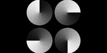
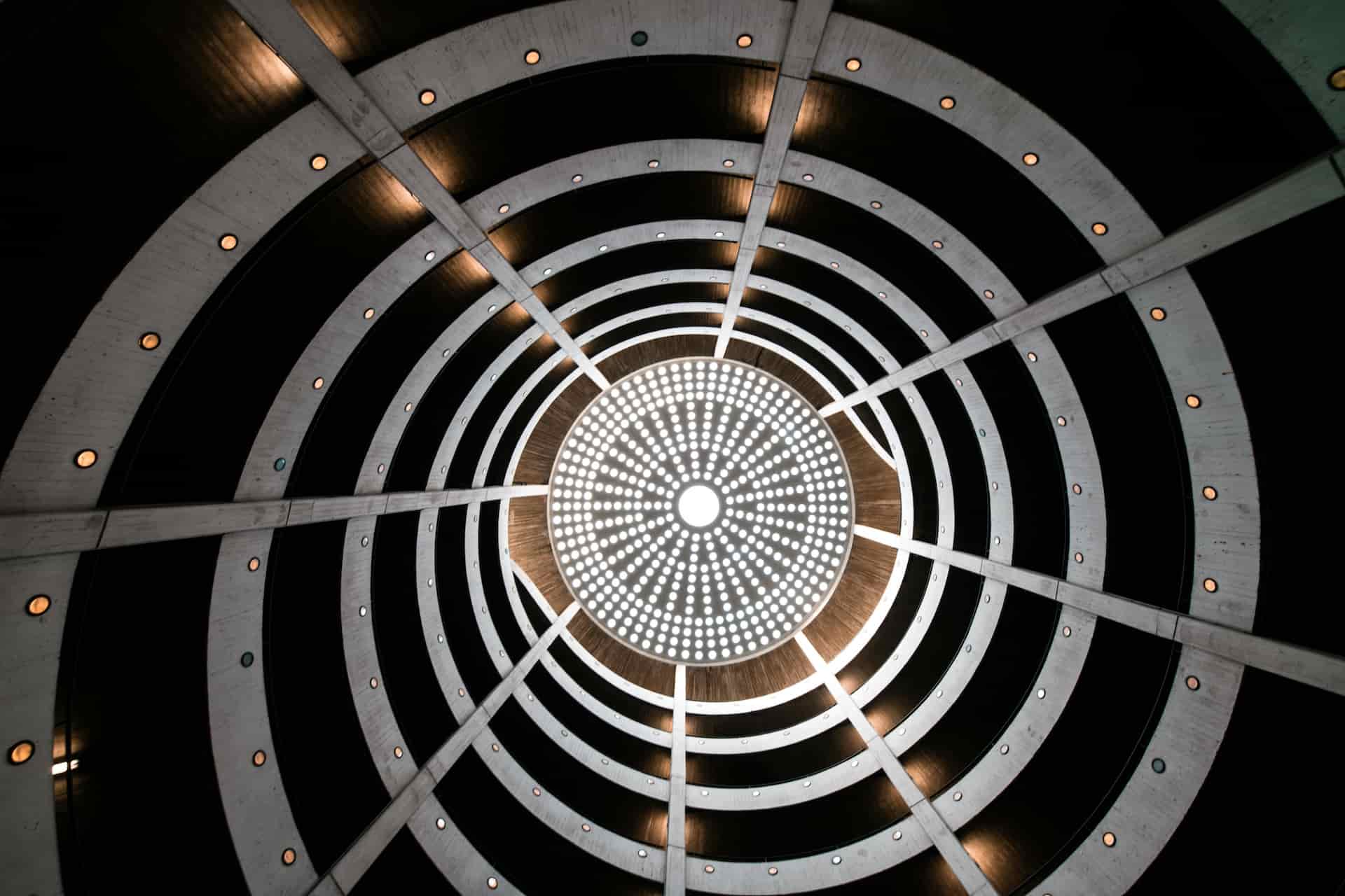
3. Radial Balance: The Circular Approach
Radial balance is when elements radiate outward from a central point. Think of a flower, a wheel, or a round table. In this case, everything is arranged in a circular fashion, drawing the eye towards the center and then outward. This creates a sense of focus and direction, leading the viewer’s gaze in a specific way.
Radial balance is powerful because it creates a strong focal point and a sense of unity. The eye is guided naturally along the curve, which can help create a sense of harmony or elegance.
Pros of Radial Balance:
- Creates strong focal points
- Evokes unity and wholeness
- Works well in circular or circular-inspired designs
When to Use Radial Balance:
- When you want to create a central focus or highlight a key element
- In designs that involve cyclical, repetitive, or organic patterns
The Role of Visual Weight in Achieving Balance
One of the most crucial elements in achieving perfect visual balance is understanding the concept of “visual weight.” Just as physical weight determines how heavy or light an object feels, visual weight dictates how dominant an element appears within a composition.
Certain factors contribute to visual weight:
- Size: Larger elements tend to feel heavier than smaller ones.
- Color: Darker, more saturated colors generally carry more visual weight than lighter hues.
- Texture: Elements with intricate or rough textures can appear heavier than those with smooth, uniform surfaces.
- Contrast: High contrast elements (like a bold red against a white background) often appear heavier than low-contrast elements.
- Position: An object placed near the center will feel less heavy than one placed at the edges of the design. The farther an object is from the center, the more weight it requires to maintain balance.
Balancing these elements effectively is one of the key challenges in achieving harmony. For example, a large, dark-colored element on one side of the page can be balanced by several smaller, lighter elements on the opposite side. It’s all about counteracting and distributing the visual weight.
Creating a Visual Flow: Movement and Balance
In addition to distributing visual weight, creating a sense of movement or flow can help guide the viewer through the design. By leading the eye in a specific direction, designers can maintain balance while keeping the design dynamic.
This movement can be achieved using lines, shapes, or even colors that create a directional path for the viewer’s eye. For example, in a website design, a user might start at the top of the page and naturally move down to the call-to-action button. The design should guide them with clear visual cues like arrows, buttons, or color contrast.
Movement doesn’t mean that the design has to be chaotic or busy. It simply means the visual elements should guide the viewer’s eye smoothly through the composition, ensuring that nothing feels jarring or distracting.
Tips for Achieving Perfect Visual Balance
Now that we’ve covered the three types of balance and visual weight, here are some additional tips for mastering visual balance:
1. Use the Rule of Thirds
The rule of thirds is a classic technique that involves dividing the design into a 3×3 grid. By placing key elements along the grid lines or at the intersections, you can create a balanced yet interesting composition. This method works well for both symmetrical and asymmetrical designs.
2. Create Contrast with Negative Space
Negative space, or the area surrounding the main elements, is just as important as the elements themselves. Using ample negative space around a focal point can make the subject matter feel more prominent, and in turn, help balance the overall design. It also creates breathing room and prevents visual clutter.
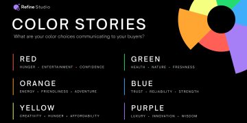
3. Stick to a Limited Color Palette
While color plays a significant role in visual balance, too many colors can be overwhelming. Stick to a limited color palette to maintain harmony. You can use contrasting colors strategically to highlight key elements while maintaining a sense of overall balance.
4. Play with Scale and Proportion
Don’t hesitate to play with the scale of elements. Sometimes, a larger item can act as an anchor for smaller items, or a smaller, lighter item can offset a larger, darker one. Just be mindful of maintaining harmony in proportion.
5. Use Grids for Structure
Grids are an excellent tool for ensuring consistent alignment and distribution of visual elements. By using a grid, you can create a sense of structure, helping elements to stay balanced across different screens or formats.
Conclusion
Visual balance may not have a single “secret formula,” but it is certainly a craft that requires both art and science. Whether using symmetry, asymmetry, or radial balance, the key is to thoughtfully distribute visual weight and maintain harmony across the composition. This ensures the design feels cohesive, engaging, and pleasing to the eye.
By mastering the elements of visual weight, contrast, and movement, you can create designs that not only look balanced but also guide the viewer’s eye in a purposeful and satisfying way. The more you practice, the more instinctive achieving perfect visual balance will become.


