


Typography, often regarded as an afterthought in the design process, is actually one of the most powerful tools in influencing user experience (UX). It shapes the way we read, interpret, and engage with content. As we delve deeper into the relationship between typography and UX, we uncover how critical this seemingly mundane aspect of design is in shaping our perceptions, emotions, and even behavior on the web.
What is Typography?
Typography is the art and technique of arranging type to make written language legible, readable, and visually appealing. While it’s primarily about the physical design of letterforms, it extends to their spacing, alignment, and positioning on the page. But typography isn’t just about aesthetics. It plays a crucial role in communication, ensuring that the message is conveyed clearly and effectively.
The Psychology of Typography
Before we dive into the nuts and bolts of how typography influences user experience, let’s first explore the psychological impact of type.
1. Font Selection and Mood
Fonts aren’t just a series of characters—they evoke emotions and set the tone for a brand, product, or website. Think about the difference between a playful, rounded font like Comic Sans and a sleek, professional one like Helvetica. The typeface you choose communicates a lot about your business, message, and even the intended user experience.
For instance:
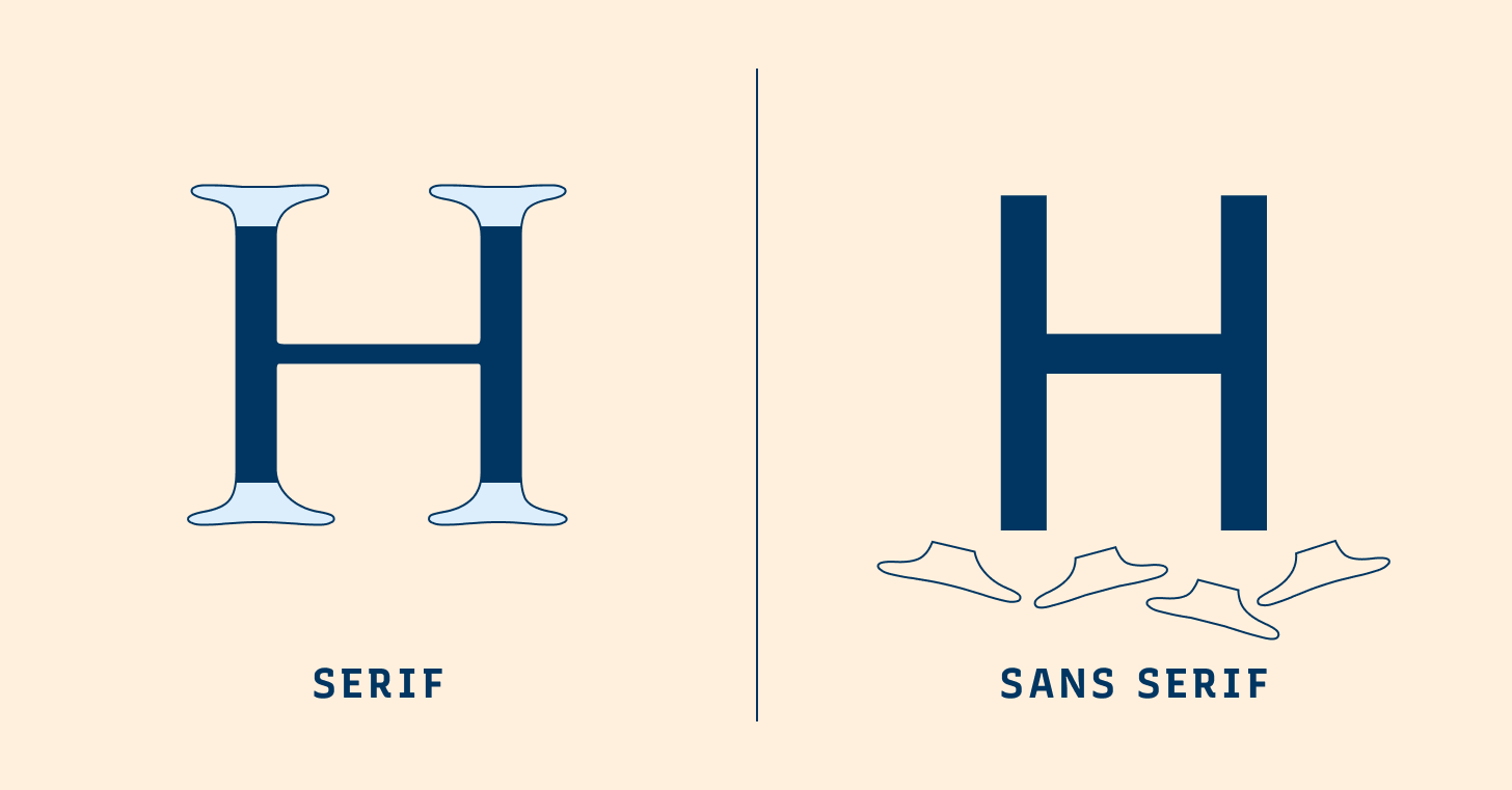
- Serif fonts (like Times New Roman) tend to feel more traditional and trustworthy.
- Sans-serif fonts (like Arial) evoke a sense of modernity and cleanliness.
- Script fonts (like Pacifico) create a personal or creative atmosphere.
Your choice of font can significantly alter the emotional journey a user undergoes on a website.
2. Legibility and Readability
Legibility refers to how easily individual characters can be distinguished, while readability is about how easily a group of words can be read in a particular setting. Poor typography, whether it’s in the form of overly small text, excessive line height, or too many different typefaces, can frustrate users and lead to disengagement.
Studies have shown that websites with legible and readable typography hold users’ attention longer. On the other hand, hard-to-read typefaces can cause cognitive overload, leading users to abandon a site.
Typography’s Role in User Experience
Now that we understand how typography can impact perception, let’s dive into its role in enhancing or hindering user experience. When done right, typography has the power to improve usability, accessibility, and engagement.
1. Improved Readability for Better UX
A website with good typography ensures that content is not only legible but also easy to consume. Proper line length, font size, and line spacing can significantly enhance readability. When text is easy to read, users spend less time squinting or scrolling to find important information. This makes the experience smooth and pleasant.
Consider the following typographic elements that impact readability:
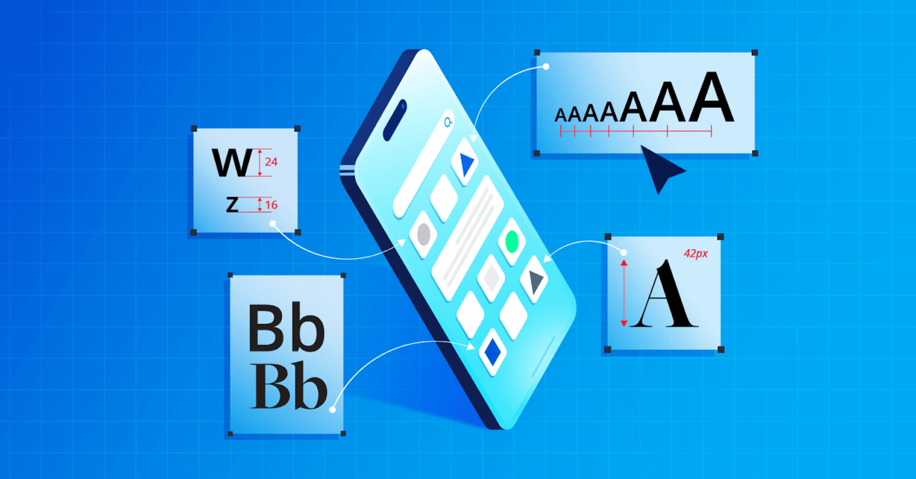
- Font size: Text that’s too small can cause strain, while too large text can break the flow.
- Line spacing (leading): Too little space makes text feel cramped, while too much can break the flow of reading.
- Letter spacing (tracking): Proper spacing helps prevent characters from appearing crowded.
2. Hierarchy and Visual Clarity
Typography creates a sense of structure. By using different fonts, sizes, and weights, designers can guide users’ attention to the most important content on a page. This technique is known as typographic hierarchy.
A well-structured page uses typography to separate headings, subheadings, body text, and calls to action, making it easy for users to scan and digest content. The more intuitive the design, the more likely users are to stay on the page and engage with the content.
For instance:
- Headings in bold, large fonts signal importance.
- Subheadings differentiate sections, helping users quickly understand what each part contains.
- Body text in a standard, readable font size facilitates easy reading.
3. Brand Identity and Consistency
Typography also plays a key role in establishing a website’s or product’s identity. Consistency in typeface choice across various touchpoints—like websites, emails, and social media—reinforces brand recognition and professionalism.
For instance, Apple’s minimalist use of typeface reinforces their sleek and modern image. In contrast, brands like Coca-Cola use customized, cursive fonts that evoke nostalgia and warmth. Typography, when aligned with brand values, ensures a cohesive and memorable user experience.
Typography and Accessibility
Typography is essential not just for aesthetics, but for making digital experiences accessible to everyone, including people with visual impairments or cognitive challenges.
1. Color Contrast
For users with low vision or color blindness, the contrast between text and background is critical. Poor contrast can make text difficult or impossible to read. Web content must ensure that text contrasts sufficiently against its background to aid readability. Tools like the Web Content Accessibility Guidelines (WCAG) offer recommendations for text contrast ratios.
2. Font Choices for Accessibility
Some fonts are easier to read than others for people with dyslexia, cognitive impairments, or other disabilities. Fonts that are too decorative or stylized can be harder to decipher. Using fonts like Open Dyslexic, Verdana, or Tahoma, which have distinct letterforms and generous spacing, can improve readability for all users.
Moreover, allowing users to adjust text size and line spacing within the interface is a great way to support accessibility.
The Influence of Typography on Mobile User Experience
With mobile devices dominating internet usage, it’s crucial that typography is optimized for smaller screens. On mobile, legibility and hierarchy become even more important. Since screen real estate is limited, the typography must work harder to convey information efficiently.
1. Responsive Typography
Responsive typography refers to the design practice of ensuring text adapts well across various screen sizes. Mobile users often have different reading patterns, so it’s important that typography is flexible. For example, line length might be adjusted to make the text fit better on a smaller screen.
2. Touch Targets and Readability
Typography should also consider how users interact with content. Buttons, links, and navigation items need to be legible and easy to tap. Font sizes and spacing should be optimized for touch interfaces, ensuring a seamless experience across devices.
Typography and Conversion Rate Optimization
On e-commerce websites or landing pages, typography can directly impact conversion rates. Calls to action (CTAs) such as “Buy Now” or “Sign Up” are more likely to be clicked if the typography is both visible and compelling.
1. Contrasting Fonts for CTAs
To make a CTA stand out, designers often use contrasting fonts, bold weights, or colors that make the button distinct from other elements on the page. For example, a CTA in a bold, sans-serif font against a bright background immediately captures attention.
2. Font Weight and Emphasis
In the body of a webpage, selective use of bold text can highlight key points or benefits. This creates a sense of urgency or importance without overwhelming the user with too much emphasis.
Case Studies of Typography in UX Design
To further illustrate the impact of typography on user experience, let’s look at a couple of case studies.
Case Study 1: Medium
Medium, a popular blogging platform, uses a clean, sans-serif typeface (a variant of the well-known font, Garamond) to present content. The minimalistic design allows users to focus solely on reading, with no distractions. The typeface is highly legible and the line length is optimized for readability. The user experience is centered around content consumption, and the typography is integral to this.
Case Study 2: The New York Times
The New York Times, a publication with a rich history of typography, uses serif fonts to evoke a sense of tradition and credibility. Their use of typography is timeless and reinforces the authority of the news. Despite being a news site, their use of typography also serves to engage readers—clear headlines, easily digestible body text, and contrasting headlines create a compelling visual flow.
Conclusion
Typography is far more than just a design choice—it’s a fundamental element of user experience. When chosen wisely, it can significantly improve readability, engagement, and accessibility. By understanding the nuances of typefaces, hierarchy, and user behavior, designers can create intuitive, user-friendly interfaces that enhance the overall experience. Typography, though often overlooked, should always be considered a core part of any design strategy.
By embracing the power of typography, designers can create experiences that are not only aesthetically pleasing but also functional and inclusive. The art of type can truly transform a digital experience from good to exceptional.


