In the ever-evolving world of web design, few concepts have had as lasting an impact as the grid layout. Grids, once considered the backbone of web design, have served as essential frameworks that help organize content and guide users through a clean, structured experience. However, in recent years, more and more designers have been moving away from these conventional grid structures. But why is this shift happening, and what does it mean for the future of web design?
The move away from grids isn’t simply a trend; it reflects deeper shifts in how we perceive visual communication, user experience, and creative freedom. The desire for more flexibility, dynamism, and originality in design has led many professionals to experiment with alternative approaches. In this article, we will explore the reasons behind this shift, the impact it’s having on the industry, and what it means for designers and users alike.
The History and Role of Grids in Web Design
Before diving into the reasons why designers are moving away from grid layouts, it’s important to understand the role grids have played in web design. Grids have been an essential part of the design process for centuries, initially seen in printed media such as newspapers and books. These systems helped create harmony and consistency in layouts, providing a structure that both designers and users could rely on.
In the context of web design, grids have served a similar purpose. They provide a systematic structure for elements such as images, text, buttons, and navigation. This consistency not only makes websites easier to use but also helps improve readability and creates a sense of balance and order. Popular grid systems, such as the 12-column grid, became standard tools for web designers, offering both clarity and control.
While grids helped establish some foundational principles of good design, over time, they began to feel restrictive. The inflexible nature of these layouts sometimes hindered creativity and innovation. This realization, combined with the evolving nature of web technology and user expectations, has led designers to seek alternative approaches.
Why Designers Are Moving Away from Conventional Grids
1. Desire for More Creative Freedom
Grids are inherently structured, which can sometimes stifle a designer’s creative potential. While they offer a sense of order and consistency, they also impose limitations. Designers, especially those in the fields of art, branding, and digital experiences, are increasingly looking for ways to break free from rigid structures to express bold, unique ideas.
Without the confines of a grid, designers can experiment with asymmetry, overlapping elements, and more fluid, organic layouts. This freedom allows them to create visually dynamic designs that capture attention and evoke emotion. Such designs break away from the predictability of traditional grid-based layouts, offering users something fresh and exciting.

2. Responsive Design and Flexibility
With the proliferation of mobile devices, responsive design has become a central focus in modern web development. Traditional grid systems, while useful for maintaining consistency across different screen sizes, often struggle to adapt to the varied and unpredictable nature of mobile experiences.
Modern web design calls for layouts that are more fluid and adaptable. Instead of adhering to fixed columns or rows, many designers are opting for more flexible approaches such as CSS Grid and Flexbox, which allow elements to dynamically adjust based on the size of the screen or container. This kind of flexibility results in more user-centric designs that provide an optimized experience across a range of devices.
3. Emphasis on User Experience (UX)
User experience (UX) has become a crucial factor in web design. Users today expect websites to be intuitive, fast, and visually appealing. Strict adherence to grids can sometimes result in designs that are too predictable or too structured, potentially leading to a sense of monotony.
Designers are increasingly focused on creating unique, immersive experiences that capture user attention. By moving away from conventional grids, designers are able to create more engaging layouts that encourage exploration, creativity, and interaction. For example, asymmetric designs and overlapping elements can create a sense of hierarchy and depth, guiding users through a website in a more natural and intuitive way.
4. Breaking the Mold of “Same-Same” Websites
With the widespread use of grid systems, many websites began to feel very similar. Grid-based layouts can result in designs that are too uniform, lacking personality or distinction. As competition among brands and websites intensified, it became increasingly difficult to stand out.
By embracing non-grid layouts, designers can introduce a sense of unpredictability that makes a website feel more memorable. This sense of individuality helps websites stand out from the crowded digital landscape. Unconventional layouts may even trigger curiosity and engagement, as users are encouraged to explore and discover the content in unexpected ways.
5. Artistic and Visual Innovation
In the past, web design often followed a template-driven approach, with designers relying heavily on established frameworks like grids to ensure usability. However, as web technologies have advanced, there is now more room for artistic expression.
Designers now have access to a wide range of creative tools—animations, parallax scrolling, hover effects, micro-interactions, and more—that allow them to push the boundaries of traditional design. By moving away from grid-based layouts, designers can create visually stunning websites that not only deliver functional experiences but also tell compelling stories through design.
6. Influence of Trends in Modern Design
The rise of new design trends such as minimalism, organic shapes, and abstract elements has also contributed to the move away from grids. These trends often prioritize creativity and simplicity over rigid structure. Clean lines and large open spaces allow for bold, eye-catching visuals, which is harder to achieve within the confines of a strict grid system.
This shift in aesthetics mirrors changes in consumer tastes as well. Users are more attuned to visually dynamic, immersive experiences and are increasingly seeking websites that feel fresh, original, and engaging. Consequently, web designers are reevaluating traditional grids and seeking innovative ways to connect with users through visual storytelling.
The Impact on Web Design: A New Era of Layouts
1. Flexibility Over Rigidity
One of the key outcomes of moving away from conventional grids is the increased flexibility it offers. Designers no longer have to adhere to a fixed set of columns and rows, allowing them to explore fluid, asymmetrical layouts. This flexibility leads to a more dynamic user experience, as websites can adjust and adapt to the needs of individual users.
With tools like CSS Grid and Flexbox, designers can build layouts that are both flexible and structured, depending on the context. Elements can flow in different directions or even be placed in unconventional positions. The result is a website that feels more responsive, creative, and modern.
2. The Rise of Fluid, Modular Design
While traditional grids are rigid, modern layouts are more modular. This approach emphasizes the ability to break content into movable and resizable components. These components can be arranged in multiple ways, allowing designers to prioritize content based on user needs, preferences, or even the flow of a particular narrative.
Modular design focuses on creating reusable, adaptable units that can fit seamlessly into any layout, whether on desktop or mobile. This modularity encourages experimentation and gives designers more creative control over the presentation of content.
3. More Engaging User Interfaces
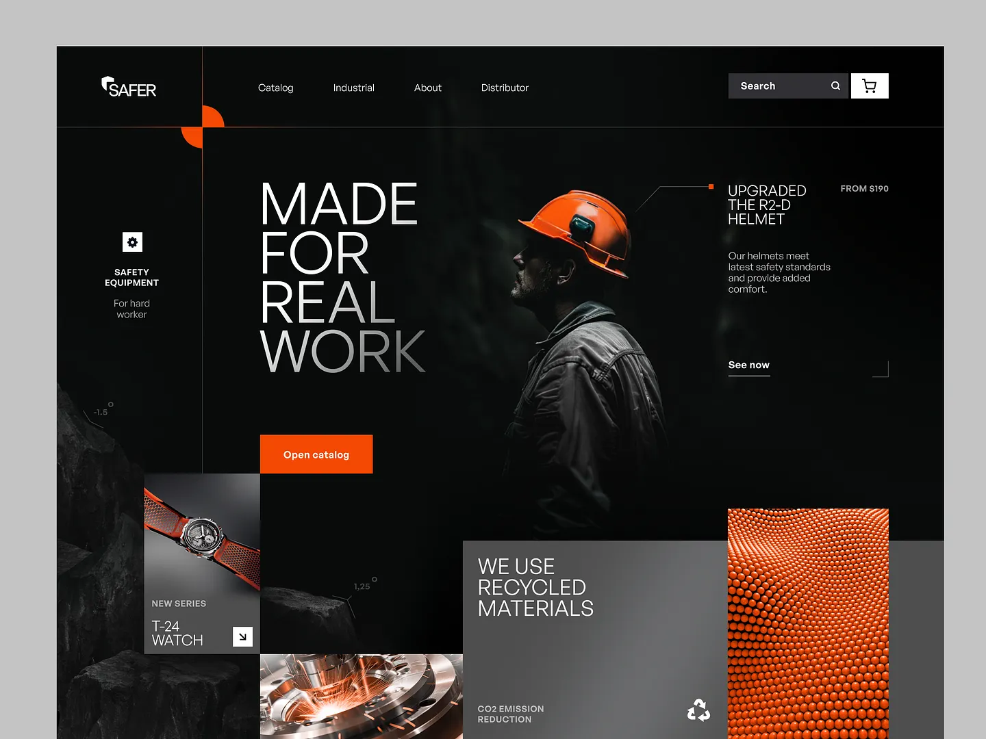
The trend toward non-grid layouts often results in more engaging, interactive user interfaces. By moving away from predictable grid patterns, designers can create more immersive experiences that capture the user’s attention. Elements that break free from the grid, such as large typography, irregular shapes, or overlapping images, can create a visual rhythm that encourages users to explore and engage.
Non-grid layouts can also evoke emotional responses, guiding users through a journey rather than just presenting information in a static manner. Such approaches make a website feel more dynamic and alive, ultimately leading to a more memorable user experience.
Conclusion: Is the Grid Really Dead?
While the shift away from conventional grid layouts is undeniable, it’s important to note that grids have not disappeared entirely. Rather, they are being used more selectively and in conjunction with other modern design techniques. The flexibility of CSS Grid and Flexbox, along with the growing emphasis on user experience and creativity, means that grids are still an important tool in a designer’s toolkit—but they are no longer the only option.
Ultimately, the trend toward non-grid layouts reflects the desire for more personalized, dynamic, and immersive web experiences. Designers are increasingly willing to break free from the constraints of conventional grids in order to explore new possibilities and better meet the needs of their users.


