In the digital age, we are constantly bombarded with a variety of images, from the vibrant, eye-catching graphics of advertisements to the sleek, professional designs of corporate websites. Among this visual overload, a trend has emerged in which monochrome visuals—those employing a limited color palette—are increasingly being favored over their colorful counterparts, especially when it comes to establishing trust. But why do monochrome visuals often feel more trustworthy than their colorful alternatives? This question delves into the psychological impact of color, the cultural associations tied to monochromatic designs, and how simplicity and minimalism can influence perception and trust.
The Psychology of Color and Trust
To understand why monochrome visuals evoke a sense of trust, we must first explore the psychology of color. Colors aren’t just arbitrary; they trigger emotional and cognitive responses based on cultural, social, and even biological factors. Each color has its own set of associations, which can either bolster or undermine trust.
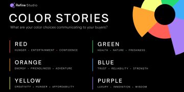
For instance, blue, often considered the most trustworthy color, is widely associated with calmness, stability, and professionalism. Many corporate and financial institutions (think of giants like Chase, American Express, or IBM) use blue as their primary color in logos and branding because it subconsciously communicates reliability and authority. However, bright, vibrant colors like red, orange, or yellow are more associated with energy, excitement, and attention-grabbing qualities. While these colors can be effective for marketing or creating excitement, they can also overwhelm the viewer and create a sense of chaos.
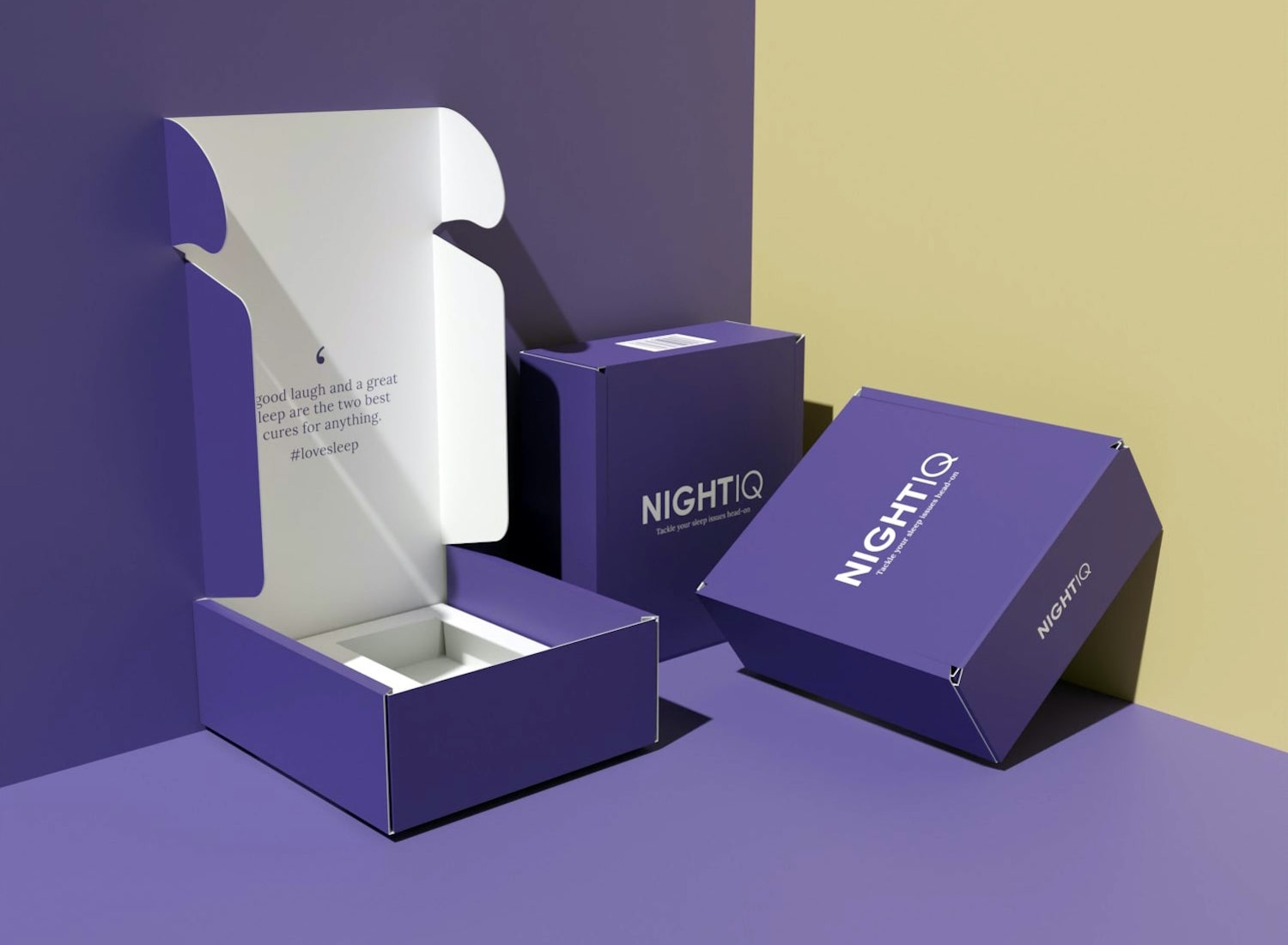
Monochrome visuals, typically defined by the use of one color in varying shades or tones, tap into the psychological concept of simplicity and control. A limited color palette reduces visual noise, which can lead to a more focused and serene experience. This minimalist approach often signals that the content or message is clear, measured, and deliberate—qualities that inherently foster trust.
The Power of Minimalism
One of the most significant reasons monochrome visuals evoke trust is rooted in the design principle of minimalism. In the context of design, minimalism is often equated with sophistication, clarity, and effectiveness. By stripping away unnecessary embellishments, a designer allows the core message or content to stand out.
When you encounter a monochrome design, especially one in neutral tones like black, white, or gray, the lack of distraction makes it easier to focus on the substance. The design doesn’t compete for your attention with a riot of colors. The absence of visual clutter can promote a sense of calm and clarity, and, importantly, order. Orderliness, especially in a chaotic digital world, can create the perception of a stable, dependable source of information.
In contrast, colorful designs can sometimes feel overly busy or chaotic, triggering a less positive reaction in viewers. This is not to say that color is inherently bad for establishing trust—it depends on the context and application—but monochrome visuals often signal that the creator has carefully considered the message and the environment in which it will be seen.
Cultural Associations with Monochrome Design
Another layer of understanding the trustworthiness of monochrome visuals lies in the cultural associations that people bring to color. For example, in many cultures, black and white designs are seen as classic, timeless, and authoritative. The black-and-white aesthetic often conveys professionalism and gravitas, which can enhance the perception of trustworthiness. In contrast, vibrant colors may evoke associations with youthfulness, playfulness, or creativity—qualities that, while appealing, might not always be perceived as reliable or stable.
Moreover, the prevalence of monochrome visuals in high-end fashion and luxury brands reinforces the idea that simplicity equals sophistication and reliability. Brands like Chanel, Apple, and Rolex use minimalist, monochrome designs to exude a sense of exclusivity and quality. Their choice to forgo loud, bright colors in favor of subtle tones signals to the consumer that these brands value understated elegance—one of the cornerstones of trust in luxury markets.
Visual Consistency and Perception of Quality
Monochrome visuals are also associated with visual consistency—a key element in branding that reinforces trust over time. When a brand uses a single color scheme, especially in its logo, website design, or advertising, it creates a cohesive, easily recognizable identity. This consistency fosters a sense of reliability because the viewer knows what to expect each time they interact with the brand.
This is particularly important when it comes to quality perception. Research has shown that when designs are unified in color, they are often perceived as being of higher quality. The visual harmony provided by monochromatic design feels polished and well-thought-out, suggesting that the creator has invested in providing a seamless, high-quality experience for the consumer.
The Role of Simplicity in Trust
Monochrome visuals also benefit from the psychological principle of simplicity. When a design is simple and straightforward, it feels more honest and approachable. The use of too many colors, on the other hand, can feel excessive and manipulative. Bright, contrasting colors can appear flashy or gimmicky, signaling a desire to distract or force attention.
This is why many companies and organizations looking to establish credibility—particularly those in industries like law, healthcare, or finance—lean toward simpler, more subdued designs. Monochrome design feels less like a marketing tactic and more like a reflection of the content’s inherent value. This simplicity signals transparency, which is crucial when trying to establish trust.
Monochrome in User Experience and Interface Design
Monochrome visuals aren’t just limited to static designs like logos or branding; they also play a critical role in user experience (UX) and interface design (UI). The success of minimalist design in digital interfaces is evident in the sleek, clean layouts of websites and apps that prioritize content over complex color schemes. A common strategy in UX/UI design is to use a monochromatic palette for the background, typography, and buttons, allowing images, text, and calls to action to stand out without overwhelming the user.
This approach provides a feeling of clarity and focus, enabling the user to navigate content without distraction. A website or app that employs monochrome visuals is typically easier to use and more pleasant to engage with, creating a sense of trust that the designers value the user’s experience. By minimizing distractions and focusing on content, monochrome design increases the likelihood of user engagement and satisfaction.
Color and Context: Why Monochrome Wins in Some Situations
While colorful designs can be highly effective in certain contexts—such as in advertising, social media, or entertainment—monochrome designs often perform better when the goal is to foster trust and credibility. The key lies in the context in which the visuals are presented.
Monochrome is often associated with seriousness and purposeful communication. Think of the stark, bold black-and-white imagery often used in editorial photography, or the straightforward design of corporate websites. These designs prioritize clarity and professionalism, which naturally contributes to a feeling of trustworthiness.
In contrast, a brightly colored design might be more effective when the goal is to attract attention quickly or create excitement—two goals less related to trust than to persuasion. Colorful visuals can be attention-grabbing, but they might be perceived as trying too hard or attempting to manipulate the viewer’s emotions. In trust-driven environments, less is often more.
Conclusion: The Unspoken Power of Monochrome
Monochrome visuals resonate because they tap into a deep-seated psychological response to simplicity, order, and consistency. The use of a limited color palette fosters an atmosphere of calm and reliability, signaling that the creator values clarity and professionalism. Moreover, the cultural associations tied to black-and-white or monochromatic aesthetics, especially in luxury and corporate contexts, reinforce the idea that simplicity equals sophistication and trustworthiness.
In an age where the digital landscape is cluttered with bright, flashy designs, the understated elegance of monochrome visuals can feel like a breath of fresh air—reliable, controlled, and ultimately more trustworthy. Whether used in branding, website design, or advertising, monochrome visuals offer a powerful tool for conveying credibility and professionalism.


