The way we interpret the world around us is shaped by multiple sensory inputs, but perhaps none is as immediate and potent as vision. Our eyes constantly sift through a myriad of visual cues, constructing meaning from the patterns we observe. Yet, not all visual stimuli are perceived equally. One fascinating element that shapes our visual perception is visual density—the concentration of visual elements within a given space. But how does this density affect our understanding of complexity? How do more or fewer visual elements influence our cognitive processing, and what implications does this have for design, art, and communication?
In this exploration, we’ll delve into the intersection of visual density and perceived complexity, discussing how we intuitively gauge complexity based on what we see. By understanding the subtle but powerful ways in which visual density impacts our cognitive systems, we can learn to optimize designs and improve communication in everything from web interfaces to product packaging.
1. The Concept of Visual Density
Visual density refers to the amount of visual information presented in a specific area or frame. In simple terms, it is the concentration of elements in a visual composition. These elements could be shapes, colors, lines, textures, or even empty spaces that form a larger whole. When an image is said to be visually dense, it typically means that the space is filled with a large number of elements packed closely together. Conversely, a less dense visual presentation might include more open space with fewer objects or smaller clusters of visual elements.
Visual Density in Everyday Life
Visual density is something we experience regularly without much thought. For example, consider the difference between walking into a chaotic marketplace versus entering a minimalist art gallery. The marketplace is often teeming with colors, shapes, and movement, while the gallery offers sparse, carefully arranged artworks. In the marketplace, the overwhelming presence of visual information may feel complex and even chaotic. In contrast, the simplicity of the gallery, where empty space plays a key role, can lead to a more calming, ordered experience.
2. Perception of Complexity
When we talk about complexity, we’re often discussing how difficult it is to comprehend or process something. Complexity, in this case, refers to the amount of cognitive effort required to make sense of the visual information presented. The more complex something seems, the more effort we believe it takes to understand it. But complexity is not always an inherent property of the subject itself; rather, it is highly dependent on the visual presentation.
Perception of complexity is not a static or objective measure. It varies based on individual cognitive load, personal experiences, and—crucially—on how information is presented to us visually.
Cognitive Load and Visual Processing
Our brains are constantly managing a delicate balance between absorbing information and processing it. When visual elements are densely packed, our brains have to work harder to sort through, organize, and interpret the data. This added cognitive load leads us to perceive such visual information as more complex. On the other hand, when visual elements are sparse, it requires less mental effort to make sense of them, thus giving the impression of simplicity.
Interestingly, our brains are not just passive receivers of information; they are active processors that seek patterns and try to fill in gaps. Visual density, therefore, plays a crucial role in how easily we recognize and organize visual information. More densely packed images often present more visual cues, forcing our brains to work harder to extract meaningful patterns. This heightened demand for attention makes the visual field seem more complex.
3. How Visual Density Affects Perceived Complexity
The Role of Clutter and Overload
Cluttered environments are often perceived as more complex due to the overwhelming presence of stimuli. The brain must continuously switch attention between different elements, which creates a sense of mental overload. Visual density plays a significant role here: as the density of objects or details increases, the ability to quickly focus on and understand each individual item diminishes.
For example, consider the design of a website or an advertisement. When too many elements—buttons, colors, texts, images—are crammed into a small space, the viewer may struggle to determine what’s most important. The overload of information can trigger feelings of confusion or frustration, ultimately decreasing the user experience. This is particularly true in contexts such as online shopping or digital media, where users expect quick, seamless interactions. In this context, high visual density may be perceived as overwhelming, creating an impression of complexity that deters users from engaging further.
Visual Density and Ambiguity
Interestingly, high visual density can also create ambiguity. In a visually dense scene, it can be difficult to distinguish between foreground and background elements, leading to a sense of disorientation. Ambiguity is often associated with complexity because it introduces uncertainty and the need for extra processing time to figure out what’s going on.
For instance, a photograph of a crowded street can seem complex because there are so many layers of information to process. Your mind has to figure out who or what to focus on: the pedestrians, the cars, the street signs, or perhaps the buildings in the background. This constant parsing of details contributes to a heightened sense of complexity.
Simplicity through Negative Space
On the other hand, visual simplicity is often achieved by reducing visual density. Minimalist design, which incorporates more negative (empty) space, is widely regarded as less complex because it limits the number of visual cues and focuses the viewer’s attention on a smaller number of elements. By reducing the amount of information to process, negative space can create a sense of calm and clarity, allowing the viewer to easily understand the most important aspects of the visual composition.
For instance, consider a website designed with ample white space. This design choice immediately reduces cognitive load, as the viewer’s attention is not diverted by unnecessary clutter. The use of negative space essentially organizes the viewer’s visual experience, making it easier to navigate and more enjoyable. In contrast, a website crammed with information, flashing advertisements, and numerous call-to-action buttons increases visual density, heightening the perceived complexity.
4. Visual Density in Different Domains
Art and Visual Aesthetics
In art, the balance between visual density and complexity has been explored by artists and designers throughout history. Some art forms—like Baroque painting—use high visual density to convey drama, energy, and emotional intensity. The intricate detailing and tightly packed compositions of such works challenge the viewer to engage deeply, processing each visual element in relation to the whole.
In contrast, modern art movements like Minimalism deliberately reduce visual density to evoke simplicity and clarity. Here, artists use sparse color palettes, geometric shapes, and ample negative space to invite contemplation and introspection. The perception of complexity in minimalist art is often less about the visual density of elements and more about the conceptual depth that the artist wants the viewer to engage with.
User Interface (UI) and Web Design
In digital spaces, the concept of visual density plays a critical role in user experience (UX) and interface design. A website or app with excessive visual clutter can overwhelm users, making it difficult to find relevant information or navigate the platform efficiently. The perception of complexity can be mitigated by employing principles of clean design—organizing information with clear hierarchies, maintaining adequate spacing between elements, and minimizing unnecessary distractions.

Consider the difference between a well-designed website like Apple’s homepage, which uses a clean, sparse layout with plenty of breathing room, and a more cluttered, text-heavy site filled with multiple pop-up ads and overlapping images. The first example feels organized, intuitive, and easy to navigate, while the second feels overwhelming and complex.
Branding and Advertising
In branding and advertising, the use of visual density can influence how a message is received. Companies often rely on visual density to communicate energy, abundance, or excitement. High-density advertising, such as the “wall of text” approach often seen in print ads, can convey a lot of information in a short amount of time. However, if not done carefully, it can overwhelm the viewer.
Conversely, brands aiming for a sleek, modern image may embrace minimalism in their visual branding. Think of luxury brands like Chanel or Rolex, whose advertisements typically feature clean, sparse designs. The limited use of text and imagery evokes sophistication and elegance, simplifying the viewer’s perception of the brand.
Information Design and Data Visualization
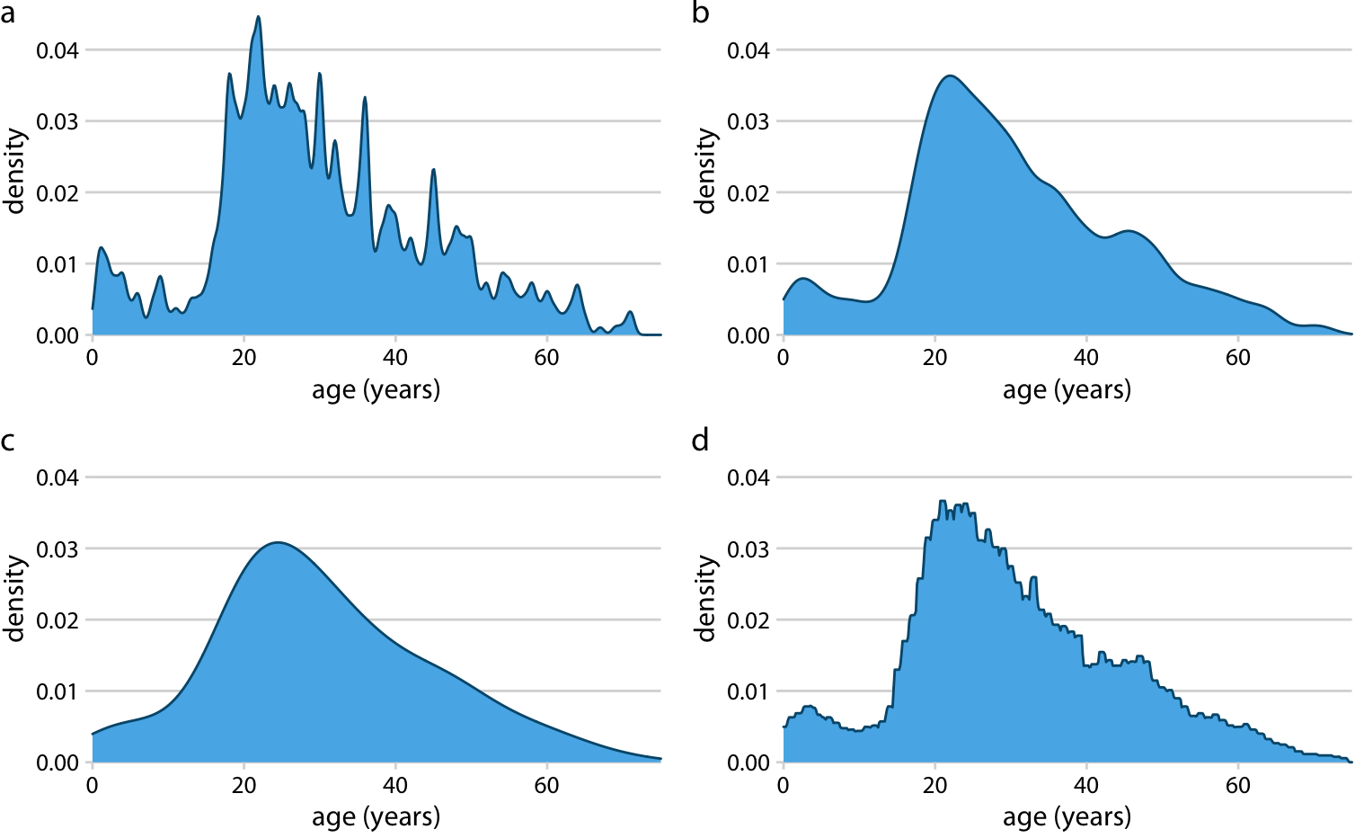
In information design, particularly in fields like data visualization, visual density can drastically impact how easily a viewer can interpret complex data. Visualizing large datasets through charts, graphs, and infographics is an effective way to reduce the complexity of raw data, but the visual density of the design must be carefully calibrated. Too many data points, colors, or lines can make a graph appear cluttered and unreadable, while too few may fail to convey the full depth of the information.
Designers often use principles of hierarchy and contrast to balance the visual density in charts, ensuring that the most important information stands out while secondary data elements remain accessible but unobtrusive. A well-designed data visualization should allow the viewer to quickly understand the key insights without feeling overwhelmed by complexity.
5. Psychological Insights: Why Does Visual Density Matter?
The impact of visual density on perceived complexity can be understood through the lens of cognitive psychology. The human brain is wired to optimize its energy and attention. When confronted with a high-density visual stimulus, the brain must expend more effort to filter, process, and understand the information. This process of “effortful processing” can be mentally exhausting, leading to the impression that the stimulus is more complex than it really is.
On the flip side, when the visual environment is simplified, it reduces the cognitive load on the brain, making it easier for us to process the information and derive meaning from it. This simplification often leads to the perception of clarity, order, and simplicity.
The Influence of Context
It’s also important to note that the perception of visual density and complexity can be highly contextual. In some cases, dense visuals might be desirable. For example, in action-packed video games or dynamic movies, a high visual density can enhance excitement and engage the viewer. However, in more reflective or informative contexts—like reading an academic paper or browsing a news website—a simpler, less dense design is usually preferred.
6. Conclusion
Visual density plays a pivotal role in shaping how we perceive complexity. Whether we’re engaging with a work of art, navigating a website, or reading a product label, the amount of visual information we are exposed to influences our mental workload. A carefully designed balance between visual density and simplicity can lead to a more satisfying user experience, whether in design, art, or information communication.
As we’ve seen, the key to understanding visual density’s role in complexity lies not just in the quantity of visual elements, but in how they are organized and presented. By recognizing the cognitive processes involved, we can create more effective, intuitive designs that align with human psychology, reducing unnecessary complexity and promoting clarity.


