Color blindness, or color vision deficiency, is often regarded as an obstacle in design, something that must be accommodated for and “fixed” through inclusive design. But what if color blindness could serve as a guide, instead of a limitation? This article delves into how understanding color blindness can not only inform but enhance design choices, driving innovation and improving user experience for all audiences.
What is Color Blindness?
Color blindness refers to a condition where an individual perceives colors differently from someone with typical color vision. The most common types of color blindness are:
- Deuteranopia (red-green color blindness) – Difficulty distinguishing between red and green hues.
- Protanopia (red-green color blindness) – Affects the perception of reds and greens, making reds appear darker.
- Tritanopia (blue-yellow color blindness) – Impairs the ability to differentiate blue and yellow colors.
- Monochromacy (complete color blindness) – Rare condition where an individual sees no color at all, only shades of gray.
It’s estimated that about 1 in 12 men (8%) and 1 in 200 women worldwide are affected by some form of color blindness. Given the frequency of this condition, it’s essential for designers to understand how to create experiences that are accessible and visually appealing to all users.
Understanding Color Perception
The human eye processes colors through cone cells in the retina. These cells are sensitive to specific wavelengths of light, corresponding to red, green, and blue. When a person has color blindness, one or more types of these cone cells are either absent or function improperly, resulting in a skewed perception of certain colors.
The misconception surrounding color blindness often stems from its name—it’s not that colorblind individuals see in black and white, but rather they experience a limited or altered spectrum of colors. Red and green hues, for example, may appear washed out or be indistinguishable from one another. This is important to keep in mind when designing color palettes for websites, apps, and other digital media.
How Color Blindness Can Influence Design Choices
Instead of merely adjusting design elements to accommodate people with color blindness, understanding this condition can lead to more thoughtful, effective design decisions. Here’s how.

1. High Contrast: Clarity Over Subtlety
When designing for people with color blindness, high contrast becomes a powerful tool. Strong contrast not only ensures clarity for users with visual impairments but also provides more engaging and intuitive interfaces for everyone. A high-contrast color scheme makes it easier to differentiate between key elements like buttons, text, and navigation menus.
Why it works: High contrast colors are often distinguishable by people with color blindness, even if they have difficulty differentiating between similar hues. For instance, using a bright yellow against a dark blue background ensures that the text or icons remain visible, no matter the type of color vision deficiency.
Consider these best practices:
- Use dark text on light backgrounds and light text on dark backgrounds.
- Avoid relying solely on color to convey important information. Combine color with text labels or patterns.
2. Use of Color Combinations with Universal Appeal
Certain color combinations are more universally distinguishable than others. For instance, blue and yellow offer good contrast and are typically easy to differentiate for people with different types of color blindness. Red and green, on the other hand, are often problematic, so designers should use them sparingly or combine them with other visual indicators like shapes, patterns, or icons.
Why it works: By steering clear of combinations that tend to confuse individuals with color blindness, designers can ensure a more inclusive experience. For example, using blue and orange together not only creates a strong visual impact but also avoids the red-green confusion that affects a large portion of the population.
3. Text Labels & Patterns: Never Rely Solely on Color
A common mistake in design is to use color alone to communicate meaning, such as in buttons, graphs, or charts. When a graph uses color-coded data to represent different categories, those with color blindness may struggle to interpret the chart if there are no additional cues. To avoid this, designers should integrate text labels, patterns, or textures to support the color choices and ensure clarity.
Why it works: Including text or visual patterns alongside color ensures that everyone, regardless of their color perception, can understand and interact with the content. For instance, a pie chart could have different patterns filling each segment, in addition to color differentiation, allowing colorblind users to differentiate the segments even if they cannot distinguish the colors.

4. Testing Designs with Color Blind Simulators
Advancements in digital tools now allow designers to simulate how their work will appear to individuals with different types of color blindness. By testing designs in these simulators, designers can identify potential problems early and make adjustments to ensure accessibility.
Why it works: These tools provide a practical way to test your design, ensuring it will work effectively for users with color blindness. It’s a proactive approach to making designs more inclusive, allowing you to make informed decisions about color choices.
5. Consider Alternative Visual Elements Beyond Color
Color should not be the sole method of communication. Visual elements like shapes, symbols, and patterns play a crucial role in making designs more inclusive. Consider using icons with different shapes to complement color choices. For example, in a form where different categories are color-coded, the use of distinct icons or patterns will ensure users can differentiate the sections even if they cannot perceive the colors.
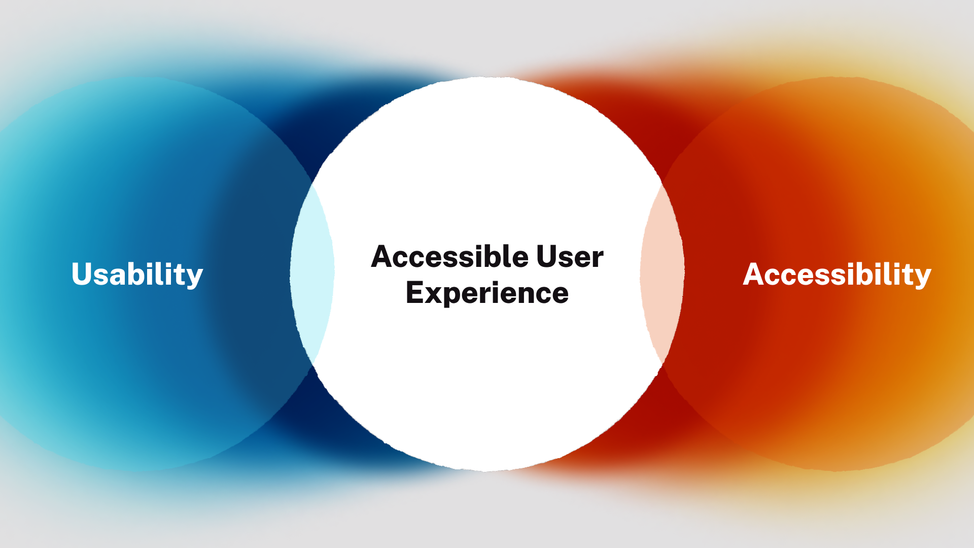
Why it works: By adding these layers of information, you’re not just making your design more accessible for colorblind users; you’re also improving its overall usability. Universal design principles suggest that multi-modal communication (using both visual and text-based cues) enhances user experiences across the board.
How Can Color Blindness Improve Design for All?
When you design with color blindness in mind, you’re not only helping those with color vision deficiencies, but you’re also creating a better experience for all users. Here’s why:
1. Enhanced Usability for Everyone
Designs that are clear, simple, and accessible are generally more usable for all audiences, not just those with visual impairments. High contrast, intuitive icons, and well-organized layouts benefit everyone, regardless of their visual abilities.
2. Universal Design: A Global Benefit
Color blindness is not restricted to one region or demographic. By designing with inclusivity in mind, you’re making your product more usable for a wider, global audience. What’s more, the principles of inclusive design often align with other good design practices, like simplicity, clarity, and user-centricity.
3. Better User Engagement
When users can easily navigate a website or app, they engage more deeply with the content. Designing with high contrast, clear labeling, and alternative visual cues ensures that users aren’t frustrated by a confusing interface, leading to longer engagement and higher satisfaction.
Conclusion: Color Blindness as a Design Opportunity
Color blindness isn’t something to simply work around; it’s an opportunity to create designs that are better, more functional, and more inclusive. By considering how people with different types of color blindness perceive your work, you’re forced to think beyond traditional color palettes and towards more intuitive, accessible, and user-friendly solutions.
When color is just one of many design elements and is thoughtfully combined with contrast, texture, shapes, and clear labeling, the result is a more versatile design that appeals to everyone, no matter their visual ability. So, can color blindness guide your design choices? Absolutely. In fact, it can take your design process to new heights, creating a richer, more accessible experience for all.


