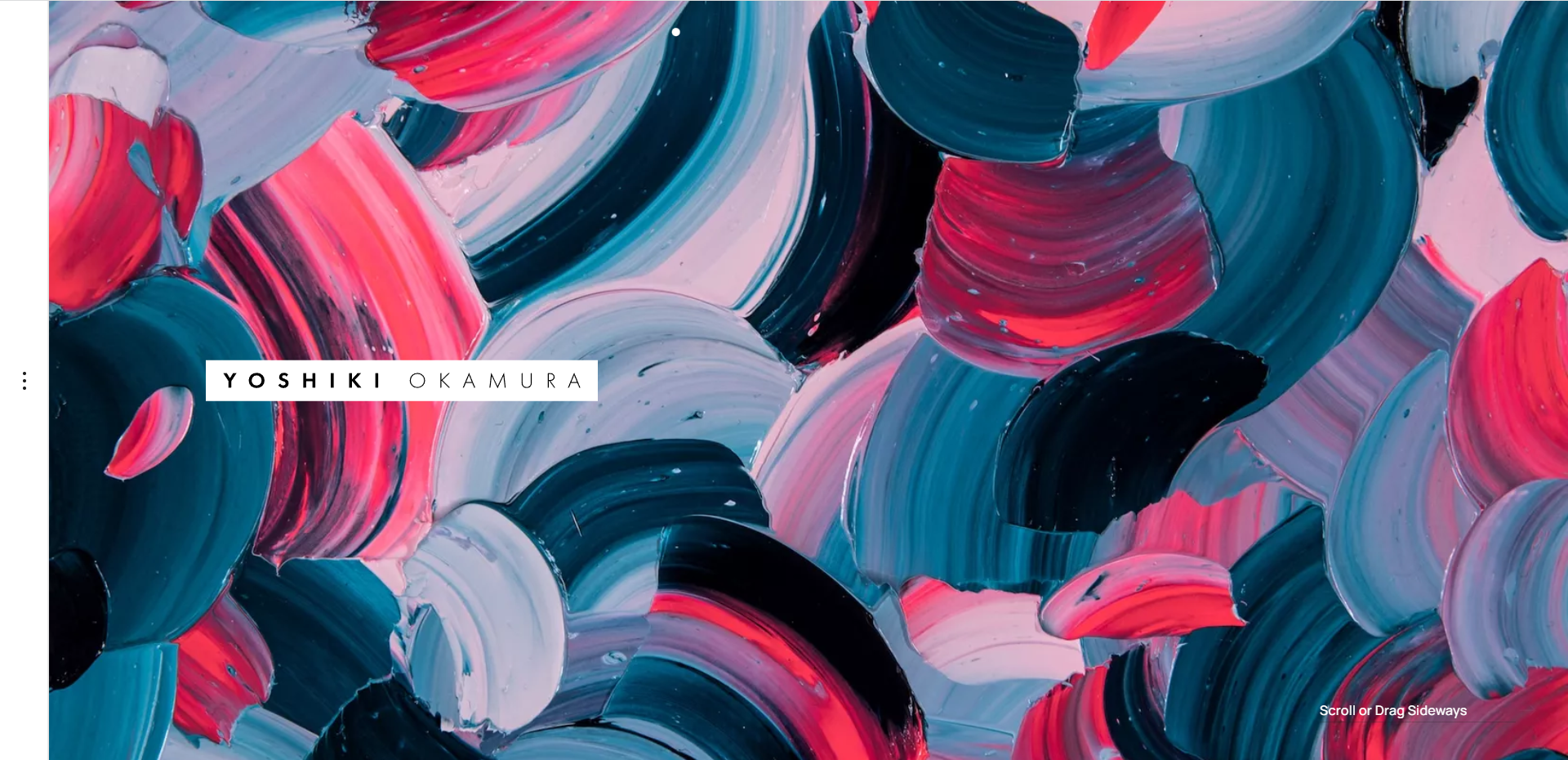
The traditional hero image—the large, visually dominant banner at the top of a website—has long been a staple of web design. The concept is simple: one striking image, often accompanied by minimal text, that conveys a brand’s identity and captures the visitor’s attention right from the get-go. Over the years, this design element has become ubiquitous, with countless websites using it to set the tone and make an immediate visual impact.
But as web design continues to evolve and user expectations shift, many are starting to question whether the traditional hero image still holds the same power. Is it time to say goodbye to this once-innovative design trend, or can it be reimagined for modern use?
In this article, we’ll take a deep dive into the hero image’s origins, its evolution, its current relevance, and the arguments both for and against its continued use. Along the way, we’ll explore whether the hero image is on its way out or if it’s just undergoing a transformation to better meet the needs of today’s digital users.
The Rise of the Hero Image: A Brief History
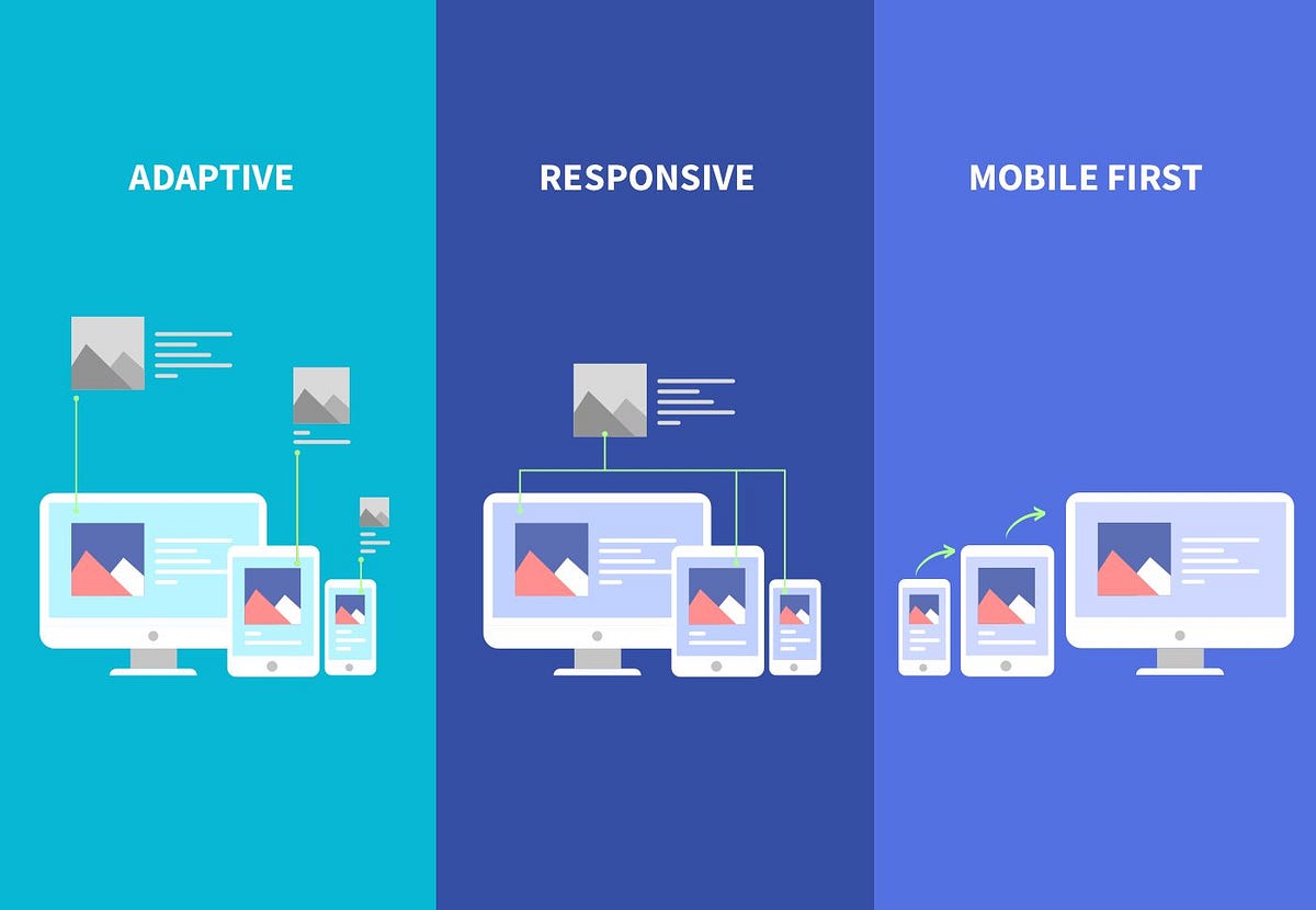
The hero image, as we know it today, started to become popular in the early 2010s when responsive web design was on the rise. Websites were no longer just being viewed on desktops; they were being accessed on a variety of devices, from smartphones to tablets to laptops. Designers needed a way to create impactful visual elements that could scale with different screen sizes without compromising design integrity.
The hero image solved this problem in a way that was both visually appealing and practical. By filling the full width of the browser window and often using a high-quality image or video background, designers were able to create a strong first impression. Coupled with bold typography and a call to action (CTA), the hero image became the go-to solution for engaging visitors within the first few seconds of a website visit.
It was perfect for businesses, as it allowed them to showcase their products, services, or brand aesthetics in a single, impactful moment. And as websites became increasingly interactive and dynamic, the hero image continued to evolve—sometimes becoming a full-screen background, sometimes transforming into a slideable carousel, sometimes featuring dynamic content like animations or video loops.
The Pros of the Hero Image
Before we jump to conclusions about whether the hero image is still relevant, let’s look at the reasons it has stood the test of time.
1. Instant Impact
The primary function of a hero image is to make an immediate impact. Visitors to a website often make decisions within a few seconds about whether they’ll stay or leave. A powerful, high-quality image can capture attention quickly and convey key messaging without the need for words.
2. Visual Storytelling
A hero image is a visual tool for storytelling. It can quickly communicate the essence of a brand’s story, values, and identity in a single frame. This is particularly effective for industries like travel, fashion, and hospitality, where visuals are a huge part of the experience.
3. Simplifies Design
The hero image allows web designers to simplify the rest of the page’s layout. With a strong visual taking up a prominent portion of the screen, other elements can be more minimal. This less-is-more approach can help keep the website clean and uncluttered, focusing the user’s attention on what matters most.
4. Works Across Devices
Hero images adapt well to different screen sizes, which is crucial in today’s mobile-first world. Thanks to their flexible design, hero images scale to different resolutions without losing their impact, making them effective across desktop, tablet, and mobile devices.
5. Easy to Integrate with CTAs
Because the hero image is the first thing users see, it often includes a call to action. Whether it’s a “Shop Now” button, “Learn More,” or “Get Started,” hero images are commonly designed to prompt action from the moment the user lands on the page.
The Decline of the Hero Image: Why the Trend May Be Fading
While the hero image has many benefits, its dominance in web design has started to wane. Over time, what was once fresh and captivating has become predictable and, in some cases, overused. Let’s examine the growing arguments against the traditional hero image.
1. Slow Load Times
High-resolution images and video backgrounds, commonly used in hero images, can significantly slow down a website’s load time. In a world where speed is crucial to user experience and SEO, slow-loading websites can lead to high bounce rates and poor conversion rates. If a site takes too long to load, visitors may leave before ever interacting with the content, no matter how stunning the image is.
2. Accessibility Concerns
Hero images, especially those with text overlaid on them, can create accessibility issues. For users with visual impairments or those who rely on screen readers, hero images may be difficult to navigate. Text may not contrast enough against the image or may be hard to read when it moves too quickly. Additionally, overly complicated or large images can overwhelm users with cognitive disabilities or those with slow internet connections.
3. Overuse and Predictability
In recent years, the hero image has become somewhat of a web design cliche. Designers across industries use the same basic structure: a full-width image with a CTA button, with varying degrees of creativity. This predictability can make websites feel stale and uninspired. When every site uses a hero image in the same way, it’s no longer a standout feature—it’s simply expected.
4. A Shift in User Behavior
The way people browse the web has changed. As we become more accustomed to fast, bite-sized content, users are less likely to wait for a large image to load or scroll down to find the content they’re looking for. Instead, people want information quickly, without unnecessary distractions. The hero image’s slow loading and dominant nature can be at odds with the trend toward speed and simplicity.
5. Space Constraints on Mobile
While hero images scale well on mobile, the small screen size can be a disadvantage. On smaller screens, hero images can take up too much real estate, forcing important content like navigation and CTAs to be pushed down below the fold. In some cases, a large hero image can even create a frustrating experience for mobile users who want to get to the content without excessive scrolling.
Alternatives to the Traditional Hero Image
If the traditional hero image is becoming less effective, what alternatives are there? Fortunately, designers are getting creative, and several trends have emerged that provide fresh ways to capture attention and engage users.
1. Video Backgrounds
Video has become one of the most engaging forms of content on the web. Short, looping background videos can convey a message or set the tone of a website much more effectively than a static image. Videos can add an extra layer of depth, providing context or illustrating action in a way that images simply can’t.
However, video backgrounds must be carefully chosen. They should be relevant, high-quality, and not too distracting. Moreover, they must load quickly and be optimized for all devices, especially mobile.
2. Minimalist Design
A growing design trend is the move toward minimalism. Instead of relying on large images to fill space, many websites now focus on clean typography, simple layouts, and well-organized white space. With this approach, content becomes the focal point, not the image. This trend reflects the current desire for speed, clarity, and less clutter.
3. Typography-Centered Design
Websites are placing more emphasis on typography to convey their message. Big, bold typefaces that stand on their own can be just as visually striking as images. This approach focuses on the message rather than the medium, offering a fresh and impactful design choice for brands that want to communicate with words rather than pictures.
4. Scrolling Interactions and Microanimations
Instead of a static hero image, websites are increasingly incorporating scrolling interactions or microanimations that engage users as they navigate through the page. This technique can create an interactive and dynamic user experience without relying on large images.
5. User-Centered Content
The modern approach to web design is focused on user-centered content, and some sites are opting to put content front and center right away. Instead of the traditional hero image, the first thing users see might be a helpful question, a clear value proposition, or a quick link to the main content. By focusing on content and clarity, these designs cater directly to the needs of the user.
Is the Hero Image Really Dead?
While the traditional hero image may be losing some of its luster, it’s not entirely dead. Instead, it’s evolving. The hero image’s ability to make a strong first impression is undeniable, but designers are finding new ways to combine visual impact with speed, functionality, and user-centered design.
Ultimately, whether or not the hero image has a place in future web design depends on context. For some websites—such as those in the creative industries or e-commerce—hero images may continue to be an effective way to showcase products or services. For others, especially those focused on delivering information quickly or offering a more minimalistic user experience, alternative approaches may prove more successful.
Rather than bidding farewell to the hero image entirely, designers should focus on making it work better, faster, and more inclusively.
Conclusion: The Future of Web Design
The hero image, like many design trends before it, will continue to evolve as web design trends change. While it’s unlikely that the hero image will disappear entirely, its dominance may be waning, with new design approaches gaining ground. By focusing on user needs and embracing new technologies, designers can create websites that are not only visually engaging but also fast, functional, and user-friendly.
