In today’s world, we are constantly bombarded with data. From the moment we wake up to the time we go to bed, we interact with numbers, charts, and statistics in various forms. But how much of this data actually sticks with us? How much of it do we truly understand or retain?
It’s no secret that data, in its raw form, can be overwhelming. Long lists of numbers, dense spreadsheets, and jargon-heavy reports can be difficult to navigate, even for experts. However, the introduction of visuals—charts, infographics, graphs, and diagrams—can completely transform how we interpret and engage with data. The power of visual storytelling is not just in its ability to entertain, but in its capacity to inform, persuade, and even motivate.
In this article, we’ll explore how visuals can make data not only more engaging but also more effective. We will discuss the psychological basis for why visuals are so compelling, delve into different types of visual tools for data presentation, and provide tips for creating impactful data visuals.
The Psychological Power of Visuals
Before we dive into the technical side of visual data representation, it’s important to understand why visuals are so powerful. Our brains are naturally wired to process images far quicker and more efficiently than text. According to cognitive psychology, our brains can process images 60,000 times faster than text, which is why we can often understand and react to visual information more instinctively.
Research has shown that humans retain visual information significantly better than textual data. This is due in part to the fact that visuals engage multiple regions of the brain, which helps to reinforce the memory. For example, when we see a graph, we don’t just see a series of numbers; we see patterns, trends, and relationships, all of which are easier to remember.
In fact, studies suggest that people are likely to remember 65% of information they see paired with visuals, compared to just 10% of information conveyed through text alone. This is why visual aids, when used appropriately, can make a significant difference in how we interpret and remember data.
Why Visuals Matter in Data Presentation
The fundamental goal of data presentation is not just to display information, but to communicate it clearly and effectively. Whether you’re trying to explain a complex concept, persuade an audience, or simply inform, visuals can be a game-changer.
Here are a few key reasons why visuals matter:
- Simplification of Complex Data: Visuals are an excellent way to break down complex datasets into more digestible parts. For example, a complicated table of financial data might look overwhelming at first glance, but by transforming it into a line graph or pie chart, the relationships between the data points become much clearer.
- Improved Comprehension: Visualizations allow viewers to grasp concepts at a glance. People are able to spot trends, identify patterns, and compare different pieces of information in a way that’s much harder with raw numbers alone.
- Increased Engagement: Human beings are naturally drawn to visuals. People are more likely to pay attention to content that includes images or videos. According to a study by HubSpot, articles with images get 94% more views than those without. In a world where attention spans are shrinking, visuals can help capture and maintain interest.
- Enhanced Retention: As mentioned earlier, people tend to retain visual information more effectively than text-based data. This means that if you want your audience to remember and internalize key insights from your data, visuals are essential.
- Easier Comparison: When data is presented visually, it becomes much easier to make side-by-side comparisons. For instance, bar charts and scatter plots allow you to immediately compare different data points and understand relationships between them.
- Increased Persuasiveness: A well-crafted visualization can be a powerful tool for persuasion. Whether you’re trying to convince stakeholders of a business strategy or encourage people to take action on a social issue, visuals help make your argument more compelling.
Types of Visuals That Enhance Data Engagement
Now that we understand the psychological power of visuals, let’s explore some of the most effective visual tools you can use to present data in an engaging and meaningful way.
1. Infographics
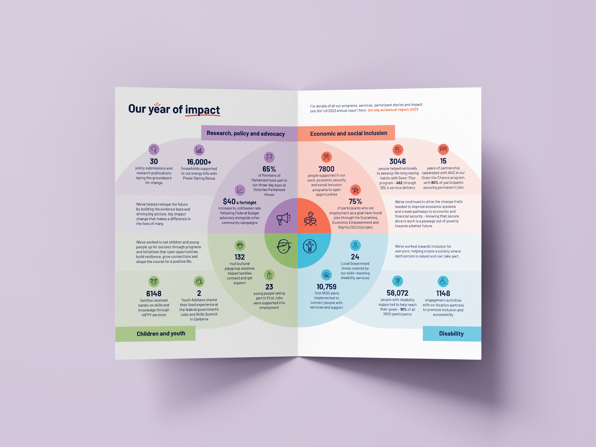
Infographics are an incredibly popular way of displaying data. They combine text, images, charts, and icons to tell a story in a visually appealing and digestible format. The beauty of infographics is that they provide context and explanation alongside the data, making it easier for the audience to understand the story behind the numbers.
Infographics are ideal for summarizing complex information in a quick and easy-to-read format. They are especially useful in marketing, education, and social media.
2. Bar and Column Charts
Bar and column charts are among the most common and versatile types of visual representations of data. They allow for easy comparison of different categories, with the height or length of the bar representing the value of each category.
Bar charts are particularly useful when comparing discrete categories, such as sales figures for different products or the performance of different teams. A stacked bar chart can also be used to break down a category into subcomponents, offering deeper insights.
3. Line Graphs
Line graphs are perfect for displaying data over time, as they show how a particular value or trend changes across a continuous period. Whether it’s tracking the stock market, monitoring website traffic, or measuring the growth of a business, line graphs provide a clear visual of how things evolve.
Line graphs are particularly effective at showing trends, fluctuations, and patterns. Multiple lines can be used in the same graph to compare different datasets.
4. Pie Charts
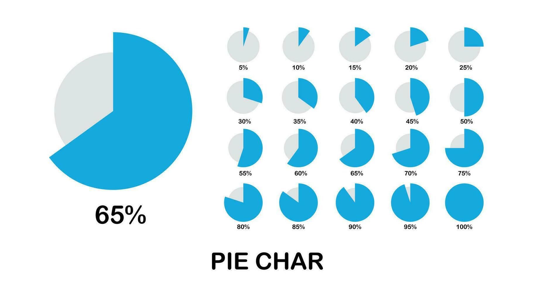
Pie charts are often used to show proportions or percentages, making them a great tool for displaying parts of a whole. They are visually intuitive, helping the audience quickly understand how different components contribute to the total.
However, pie charts can become ineffective if they contain too many segments or if the differences between the slices are minimal. When used appropriately, though, they can help clarify the relative importance of different components within a dataset.
5. Heat Maps
Heat maps use color to represent data values, with warmer colors indicating higher values and cooler colors indicating lower values. They are especially useful for visualizing large datasets, as they help identify areas of intensity or concentration at a glance.
Heat maps are often used in fields like website analytics, where they can show user activity across different sections of a page, or in geographical data, where they can highlight regions with higher or lower occurrences of a particular event.
6. Scatter Plots
Scatter plots are used to show relationships between two variables, with data points plotted on a two-dimensional axis. These plots can reveal correlations, clusters, or outliers, making them a valuable tool for statistical analysis.
Scatter plots are particularly useful for scientific and business data analysis, as they help identify patterns and trends between different variables.
7. Dashboards
Dashboards provide a consolidated, at-a-glance view of key performance indicators (KPIs) and metrics. They often include a combination of bar charts, line graphs, and other visual elements to provide a comprehensive overview of the data.
Dashboards are widely used in business and analytics, as they allow decision-makers to quickly assess performance, identify problems, and make data-driven decisions.
8. Data Storytelling
Data storytelling is the art of weaving data into a narrative that guides the audience through a particular message or insight. By combining data with visuals and context, you can create an emotional connection with your audience and make the data more relatable.
Effective data storytelling requires not just the right visuals, but also the right narrative. It’s about framing the data in a way that resonates with your audience, guiding them through the data, and helping them understand its significance.
Tips for Creating Engaging Data Visuals
While the type of visualization you use will depend on the data and your objectives, there are several best practices that can help you create effective and engaging data visuals.
- Keep It Simple: Avoid cluttering your visuals with too much information. The goal is to highlight key insights, not overwhelm your audience with unnecessary details. Use whitespace effectively to allow the data to breathe and make it easier to focus on the important elements.
- Choose the Right Chart Type: Different types of data require different types of visualizations. Make sure you’re using the most appropriate chart for the information you want to convey. For example, if you want to show a trend over time, use a line graph, not a pie chart.
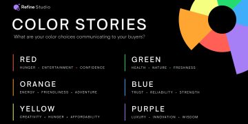
- Be Consistent with Color: Colors can convey meaning, so it’s important to use them consistently. For example, you might use red to indicate negative trends and green to show positive ones. But don’t overdo it—too many colors can confuse the audience.
- Label Clearly: Make sure your charts and graphs are well-labeled, with clear titles, axis labels, and legends. This will help your audience understand the context of the data and make it easier for them to interpret the visuals.
- Highlight Key Insights: Don’t bury the lead. Make sure your most important insights stand out. Use design elements like callouts, arrows, or contrasting colors to draw attention to critical points.
- Ensure Accessibility: Not everyone perceives data visuals in the same way. Make sure your visuals are accessible by using high-contrast colors, large fonts, and alternative text for those who might be visually impaired.
Conclusion
In an age where data is omnipresent, visuals are essential in making that data not only more engaging but also more understandable. Whether you’re trying to inform, persuade, or entertain, the right data visualization can transform a complex set of numbers into a story that resonates with your audience. By understanding the psychological power of visuals, choosing the right type of chart, and following best practices for design, you can ensure that your data has the impact it deserves.


