In today’s digital age, visual content plays an undeniably important role in communication. From websites to social media platforms, video marketing, and even in educational settings, the effectiveness of visual communication is clear. However, it’s crucial to ask: Is your visual content accessible to all audiences?
When we talk about accessibility in visual content, we’re not just referring to whether the content looks appealing. Accessibility encompasses the ability of all users—regardless of their physical abilities, technical resources, or socio-cultural backgrounds—to access, comprehend, and engage with your content. This goes beyond a simple design and touches on making sure that your content works for everyone, including people with disabilities, those using assistive technologies, and those with different devices or internet speeds.
This article will explore the various facets of accessible visual content—what it is, why it matters, and how you can make sure that your visuals are accessible to as many people as possible.
1. Understanding Visual Accessibility
Visual accessibility refers to how easily people can perceive, interact with, and understand visual elements. This includes considerations like color contrast, font size, image descriptions, and visual cues. While visual content may seem intuitive or self-explanatory to some, it may not be so for all.
For example, consider someone who is colorblind. A graphic that relies heavily on specific color coding may render the information unreadable to that individual. Or think about someone with a visual impairment who may rely on screen readers to navigate content. If your images aren’t described with alt-text, they would miss out on that important information.
2. Why Visual Accessibility Matters
A. Legal Implications
One of the primary reasons accessibility is so important is because of legal requirements. Laws like the Americans with Disabilities Act (ADA) in the United States, the Equality Act 2010 in the UK, and the European Accessibility Act have created a legal obligation for businesses to ensure their digital content is accessible to people with disabilities.
Failure to comply with these regulations can result in lawsuits, fines, and a tarnished reputation. Therefore, creating accessible visual content not only makes good ethical sense, but it can also save you from costly legal troubles.
)
B. Increased Reach and Audience Engagement
Another reason accessibility matters is that it allows you to engage a wider audience. By ensuring that your content is usable by people with disabilities, you’re opening the doors for all users, regardless of their abilities. This could include people with visual impairments, those who are deaf or hard of hearing, individuals with cognitive disabilities, and so on.
Studies have shown that accessible websites and content generally result in better user engagement. Accessibility features like alt-text descriptions, high contrast visuals, and closed captions can make your content more understandable, more inclusive, and easier to use, thereby improving the overall user experience.
C. Ethical Responsibility
Accessibility is, at its core, an issue of fairness and inclusion. The digital world should be accessible to everyone, not just those who are able-bodied or have access to the latest technologies. As a creator or business owner, you have a responsibility to ensure that your content is usable by the widest range of people possible.
3. Principles of Accessible Visual Content
Here are some key principles to guide you when designing accessible visual content:
A. Text Readability
Font Choice: Choose fonts that are simple and legible. Sans-serif fonts (e.g., Arial, Helvetica) are often easier to read than serif fonts (e.g., Times New Roman) for web content. Avoid overly decorative fonts that might be difficult to decipher.
Font Size: Always use a font size that’s large enough for readers to comprehend easily. Ideally, your body text should be at least 16px. Remember, a significant percentage of users may have impaired vision, so larger text sizes are crucial.
Line Spacing: Ensure proper line spacing (also known as leading) to make reading easier. Crowded text lines can confuse readers, especially those with dyslexia or cognitive disabilities.
Contrast: The contrast between your text and background is vital. Ensure there’s sufficient contrast (at least a 4.5:1 ratio) between text and background to accommodate people with visual impairments or color blindness. Tools like the WebAIM Contrast Checker can help ensure compliance.
B. Color and Color Contrast
Color is a powerful tool in design but can be problematic for people with color blindness. Approximately 8% of men and 0.5% of women worldwide have some form of color blindness, which makes it essential to use colors that work well together for these users.
Avoid Using Color Alone to convey important information. For example, a graph that only uses red and green might be indecipherable for someone who is red-green colorblind. Instead, combine color with texture, labels, or patterns to make sure your message is clear to everyone.
Color Contrast Tools: Tools like Color Oracle can simulate how your designs appear to people with various types of color blindness. This helps you adjust your content so that it’s accessible to all users.
C. Alt-Text and Image Descriptions
Alt-text is a critical component of accessible visual content. It’s a textual description of an image that’s read aloud by screen readers for visually impaired users. Alt-text should be concise but descriptive, conveying the essence of the image to those who cannot see it.
- Good Alt-Text Example: “A woman smiling while using a laptop in a bright, cozy office setting.”
- Bad Alt-Text Example: “Image of a woman.”
Alt-text should also be used for graphics, charts, and infographics. People who rely on screen readers need to understand what the visual is portraying, whether it’s a statistical graph, a diagram, or even a logo.
D. Accessibility of Video Content
Videos are a powerful visual medium, but they can be inaccessible to many without certain considerations:
Captions/Subtitles: Always provide closed captions for videos. This ensures accessibility for people who are deaf or hard of hearing. Captions should not only transcribe dialogue but also describe important non-verbal sounds (e.g., “door creaks,” “birds chirping”).
Audio Descriptions: For individuals with visual impairments, audio descriptions are crucial. These are additional narrations that describe what is happening on screen, such as “a man opens a door and enters a room.”
Transcript: Offering a transcript of video content is another great way to make your videos more accessible. This allows people to read the content if they’re unable to watch or listen.
E. Responsive and Mobile-Friendly Design
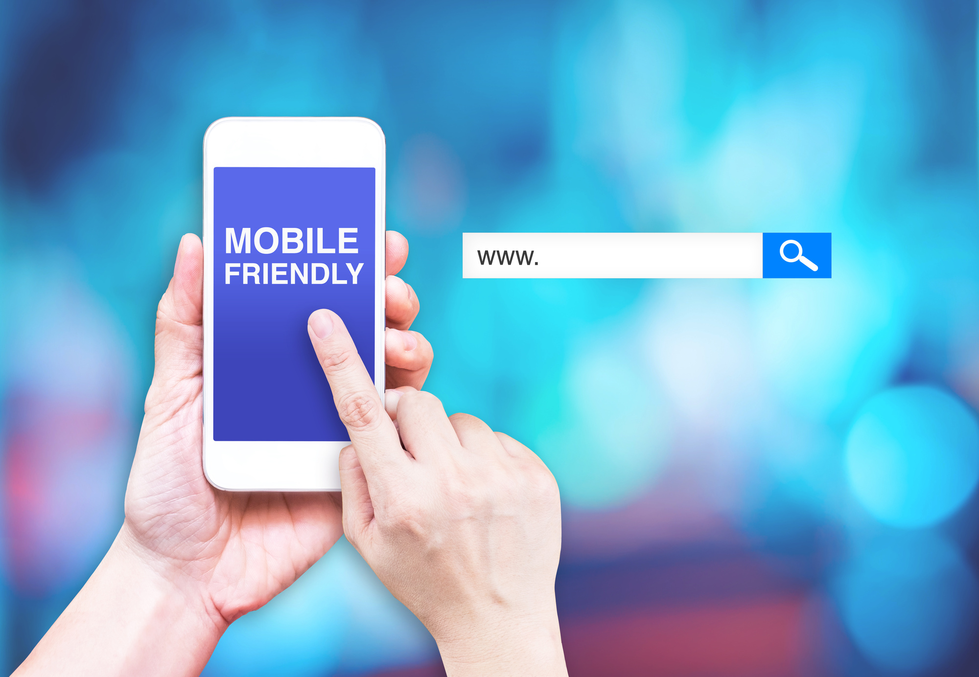
Accessibility isn’t just about text and colors; it’s also about ensuring that your visual content is accessible across all devices. More and more people are accessing the web on smartphones and tablets. Therefore, ensuring that your visuals are responsive—i.e., they adjust and display correctly on various screen sizes—is key to reaching a wider audience.
This includes:
- Scalable images and elements that adjust depending on screen size.
- Mobile-friendly navigation to ensure that people can access and interact with your content easily on smaller devices.
4. Tools for Ensuring Visual Accessibility
There are several tools available that can help you assess and improve the accessibility of your visual content:
- WebAIM Contrast Checker: To check text-to-background contrast ratios and ensure they meet accessibility standards.
- Color Oracle: A color blindness simulator to test how your content appears to people with different types of color vision deficiencies.
- WAVE Web Accessibility Evaluation Tool: A browser extension that identifies and provides suggestions for improving the accessibility of websites.
- Axe Accessibility Checker: A tool that provides an easy-to-understand breakdown of accessibility issues and helps with resolving them.
- Screen Readers: Tools like JAWS, NVDA, and VoiceOver can be used to test how your content is read out loud and perceived by individuals with visual impairments.
5. Best Practices for Accessible Visual Content
- Simplify Designs: Keep your designs simple and uncluttered. Too much information or too many competing elements can overwhelm users, particularly those with cognitive disabilities or learning challenges.
- Test Regularly: Run accessibility tests throughout the design and development process. The earlier you catch potential issues, the easier it is to fix them.
- Use Descriptive Headers and Labels: Clear and descriptive headers not only improve SEO but also make it easier for all users to navigate your content.
- Provide Multiple Ways to Engage: If your content relies heavily on one medium (e.g., video), ensure there are alternative ways for people to access the information, like a written transcript or a text-based summary.
6. Conclusion
Making your visual content accessible is not just a technical consideration—it’s a moral and legal one as well. Accessible content ensures that everyone, regardless of their abilities, can enjoy and interact with your digital creations. By following best practices and using the right tools, you can create a more inclusive, effective experience for all your users.
Accessibility may require extra effort upfront, but the benefits—legal compliance, wider audience reach, and improved user experience—are well worth it. And remember: a world where all digital content is accessible is one where everyone can participate, contribute, and succeed.
